Some friends started a video production company and I helped them by creating their branding. The duo were young and smart and loved telling stories through film, video, etc. While they lived in Brooklyn many of their clients were in D.C. and were more corporate. So, they wanted to create materials that represented them but did not turn off clients who would be looking for a buttoned-up partner. They were in the beginning stages of their business and the future held exciting possibilities. With their new logo and branding they were ready to hit the ground running.The concept of camping and adventure makes for an imaginative logo exploratory. I created a number of options to present to the team:
Basecamp has a hip, industrious, go-getter vibe. For this logo I wanted to create something inspired by old school sports pendant design.
This logo has the right mix of hip and sophisticated with the modern lockup and structured serif font.
The elements on this badge are metaphorical: Basecamp guides their clients in telling stories and in the symbols in the logo are guidance tools such as maps and compasses while in the center sits a comfortable home base.
In this logo the text is congruous with the mountain. It feels like no matter where the client is in their journey, Basecamp is there at every point to help along the way.
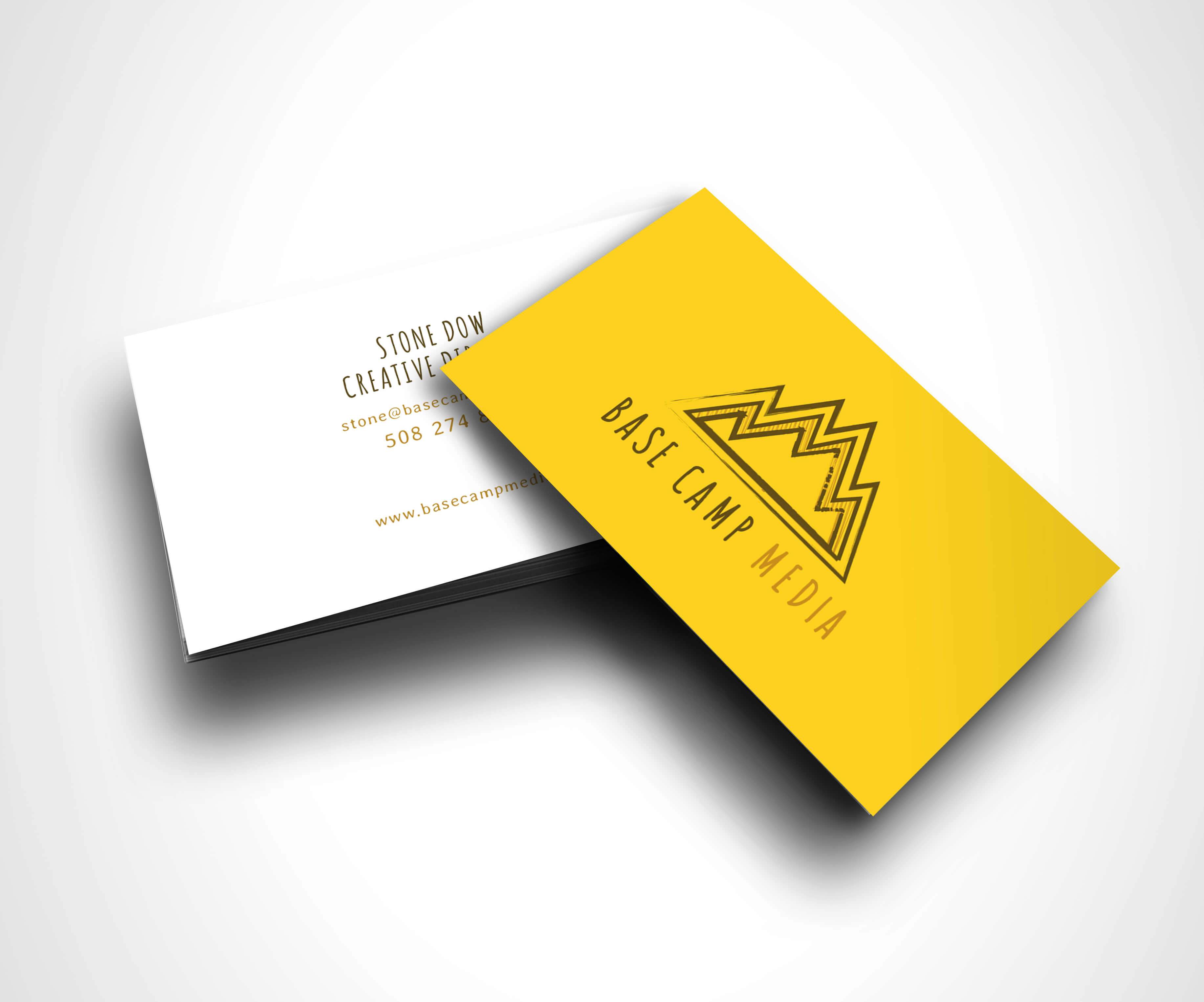
The "M" of camp and media conjoin and create a symbol of a mountain. This is an innovative way to look at the logo structure for Basecamp.
The rustic nature of the screen printed font and pine trees feel fresh but the font is structured enough so it will look professional and inviting to clients.
And the winner was!
Basecamp tells client stories about clients' struggles and achievements, the cascading ridges and woodcut feel represents that.
We also created business cards for the Base Camp team.