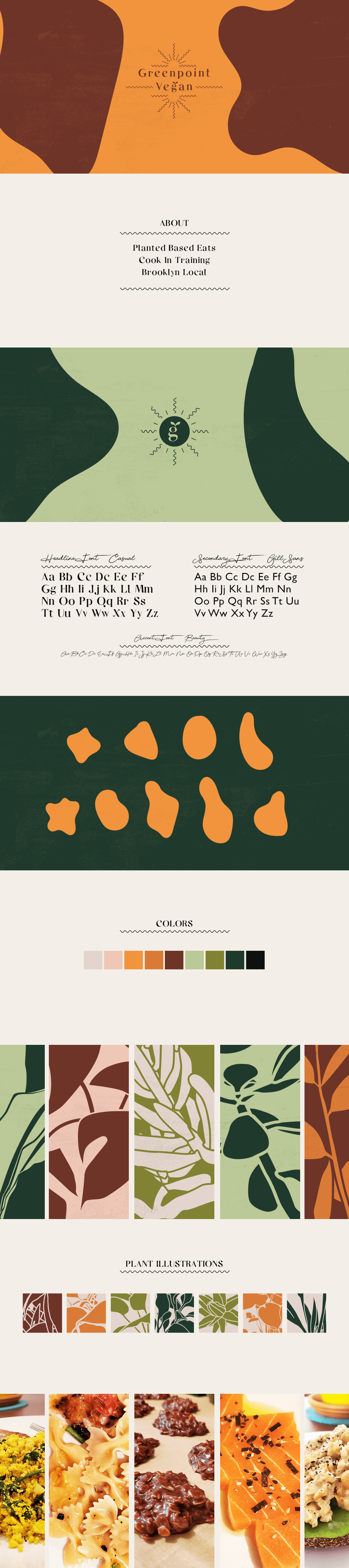
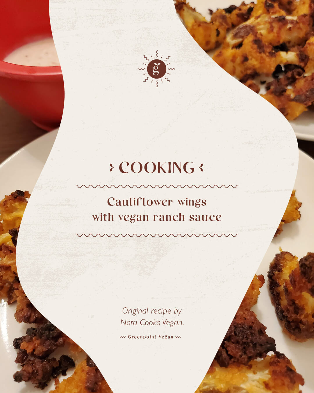
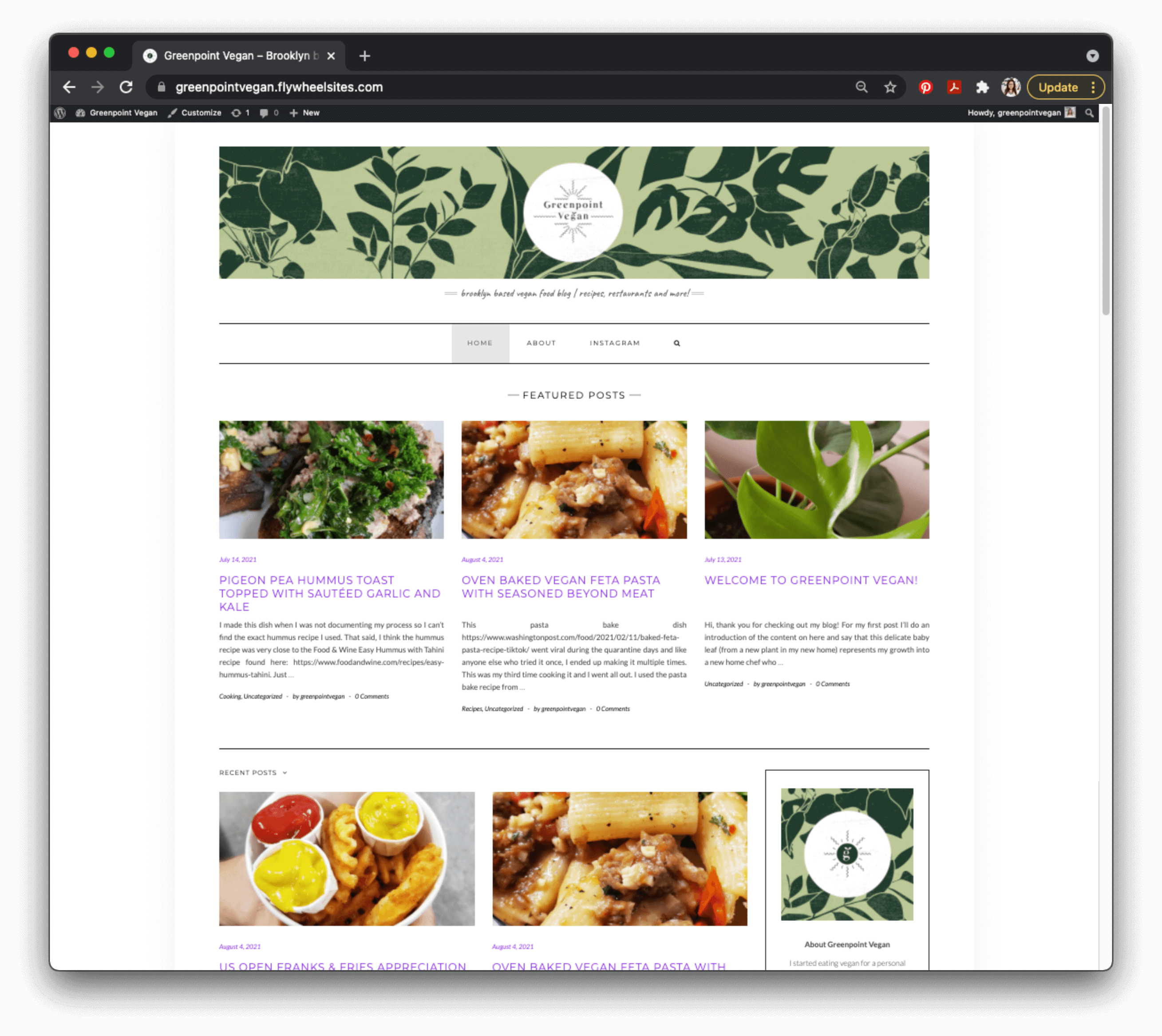
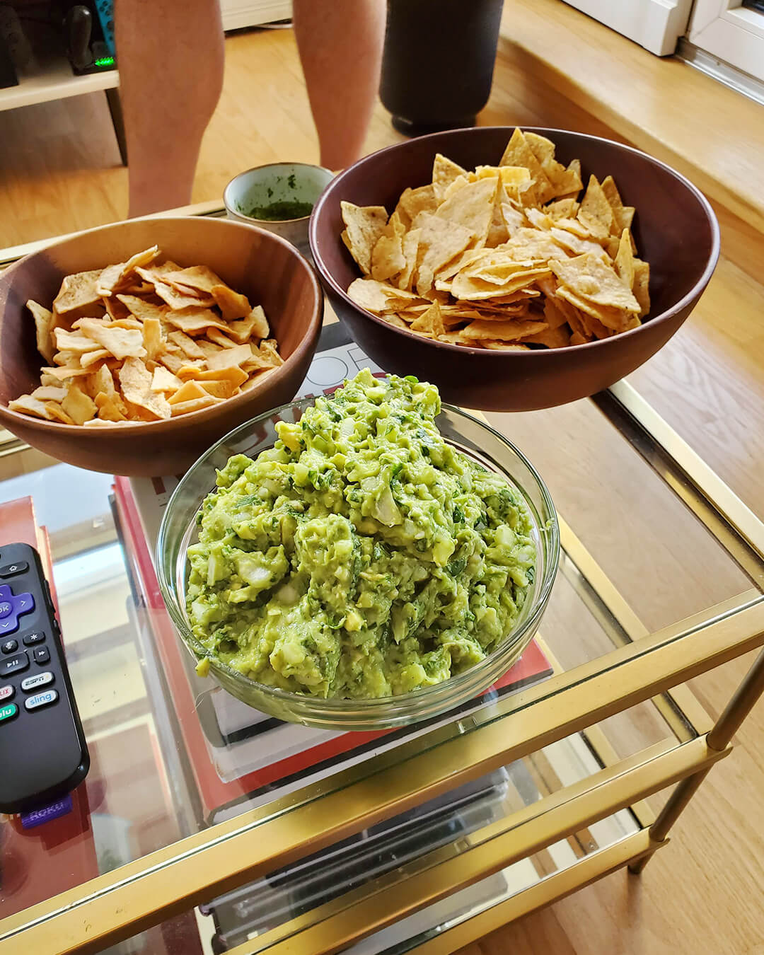
I started cooking and documenting my experiences more the past year and in order to remember all of the recipes and have a space to store them I started branding for a food blog Greenpoint Vegan. It's still in progress at the moment but here is some initial work.
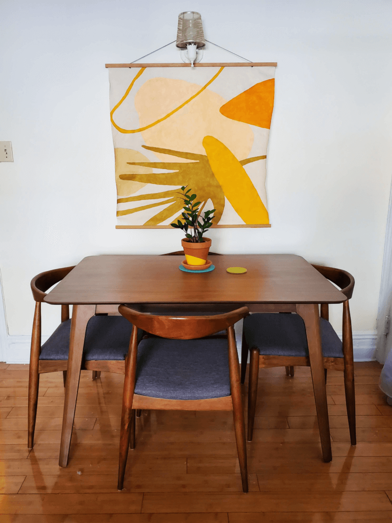
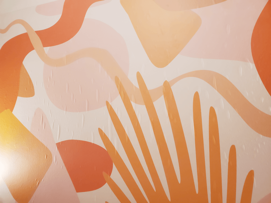
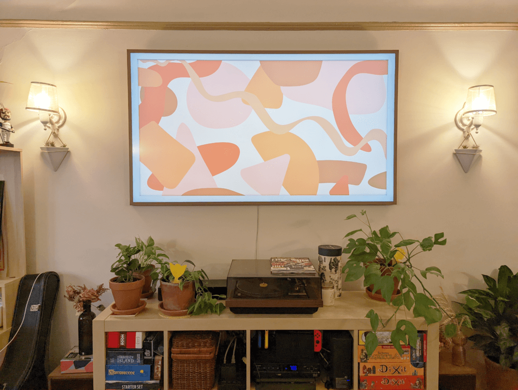
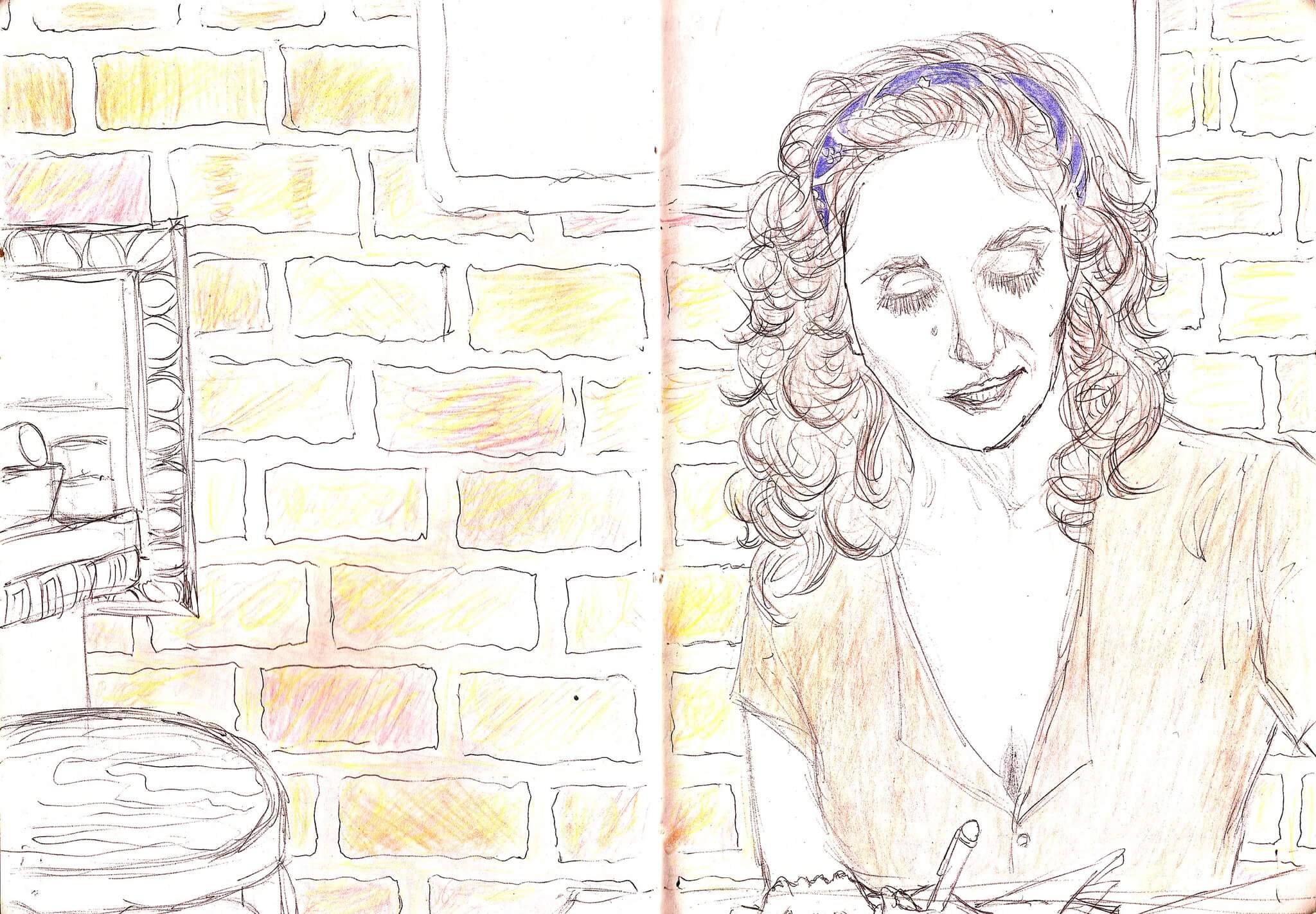
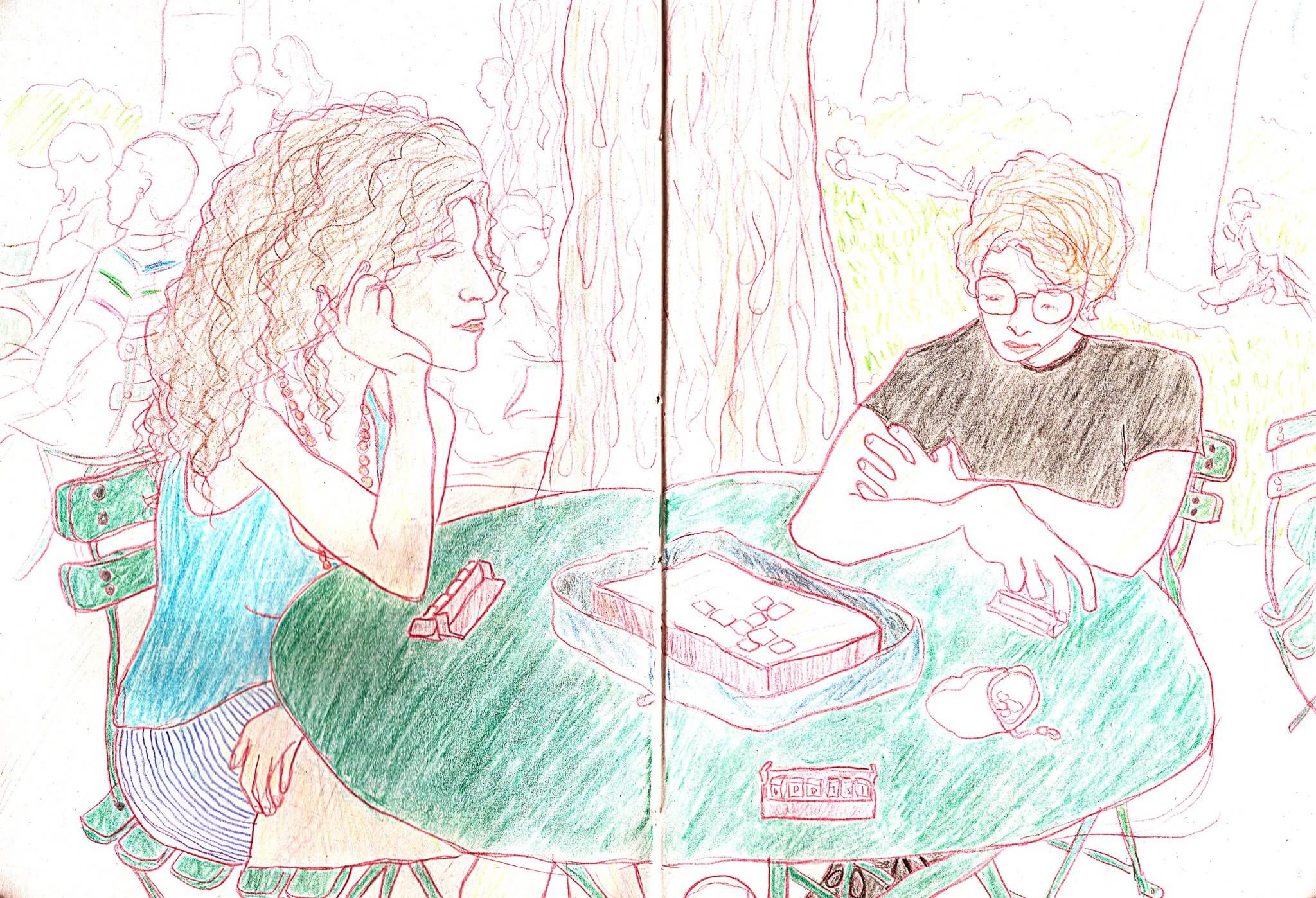
During the pandemic I moved and with more space to live and work in I started to tap into my craftier side and because of that I decided to make art. Here is a picture of the painting I made.
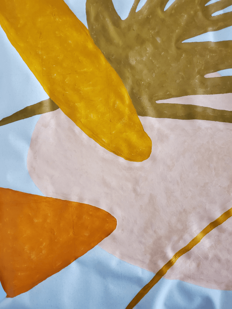
Also worked on a similar print for another room.
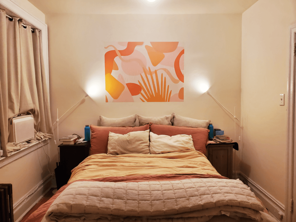
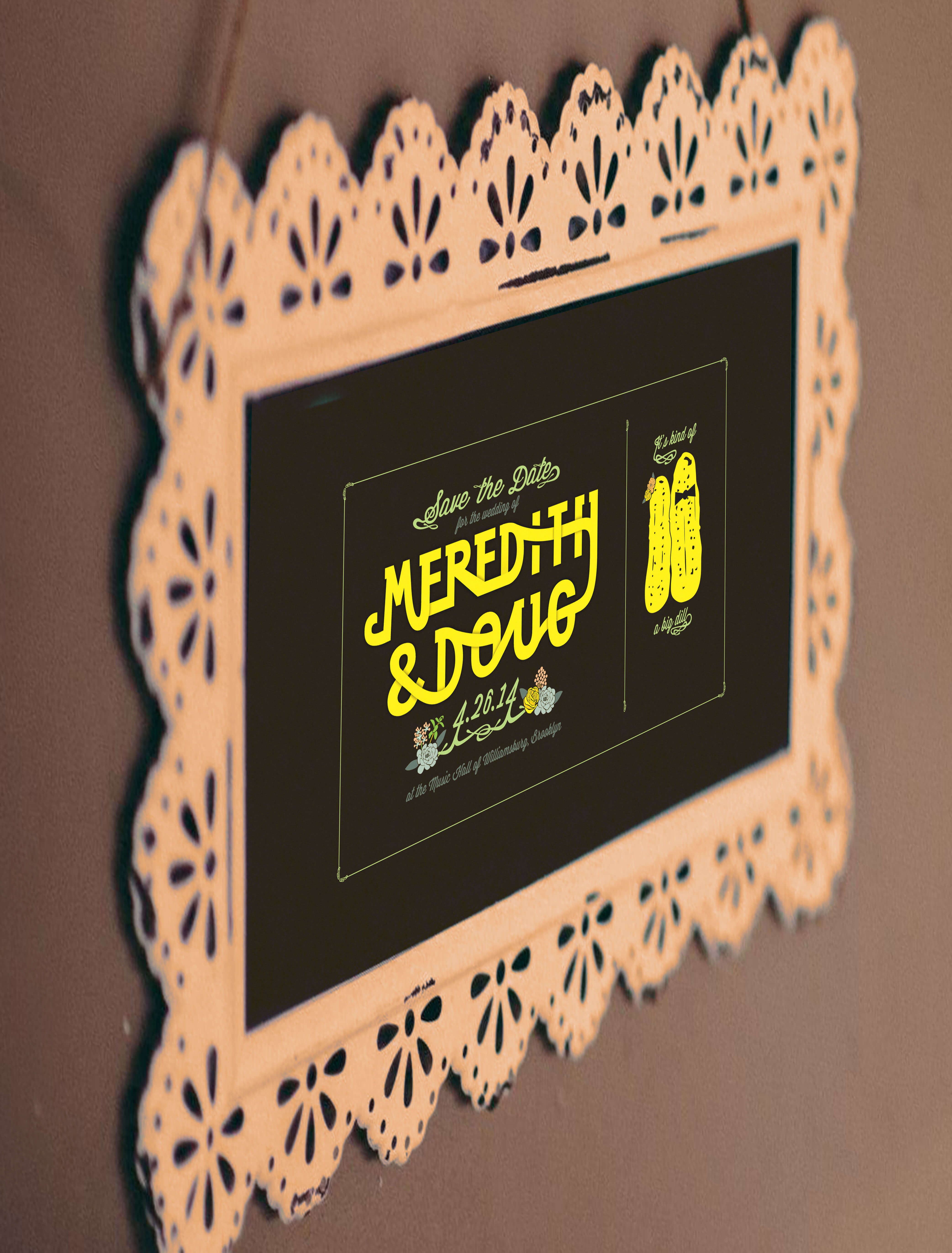
When we got our TV I made art to display while it is in sleep mode.
Very happy with how all of the work turned out and plan on making more in the future.
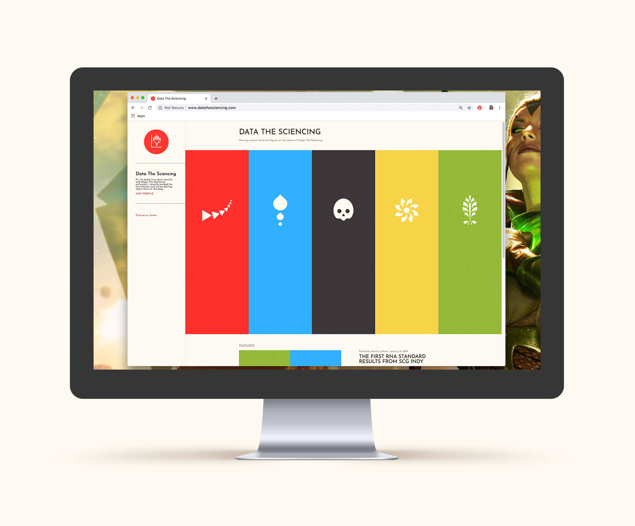
My boyfriend is a data scientist and is very into Magic The Gathering. He started writing articles merging the two subjects and I helped him by creating a blog and branding for his project. http://www.datathesciencing.com/
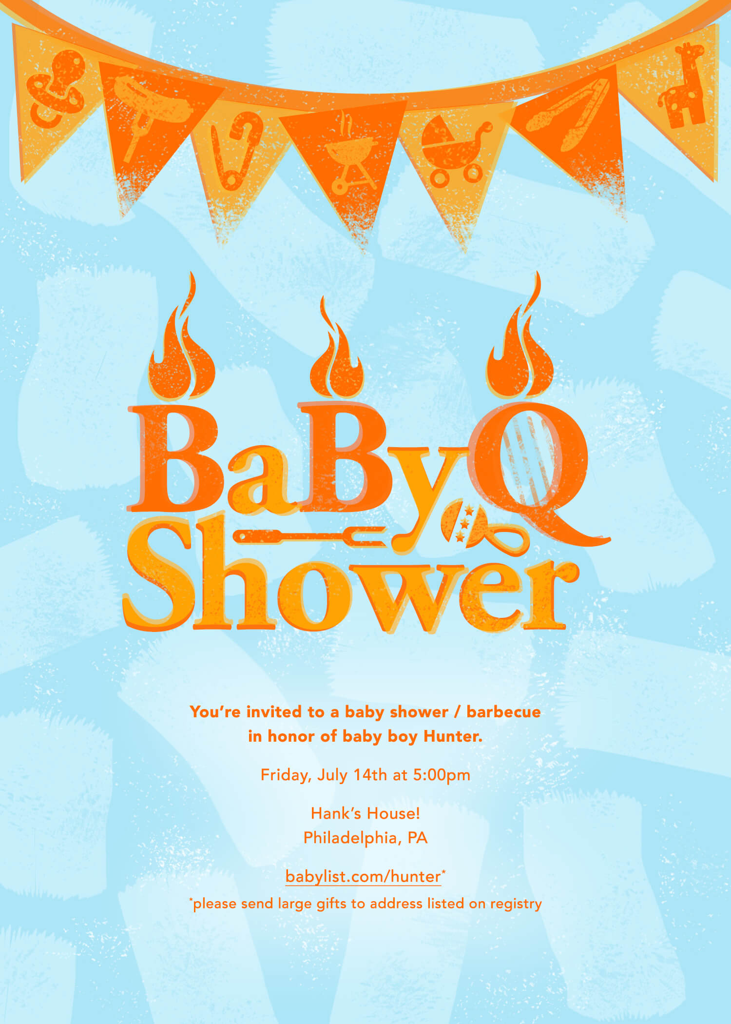
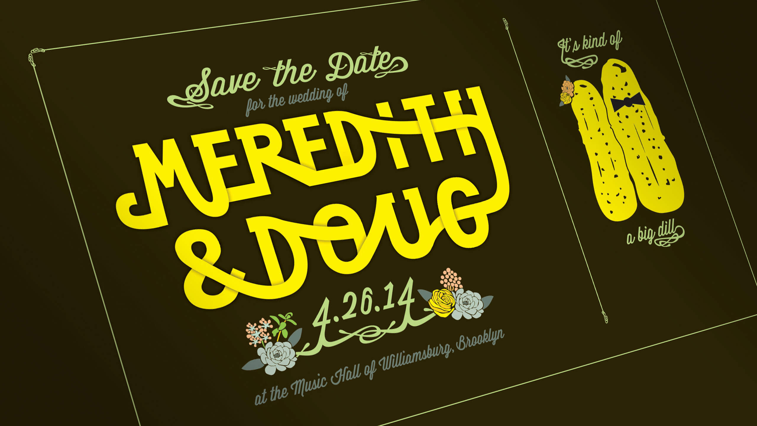
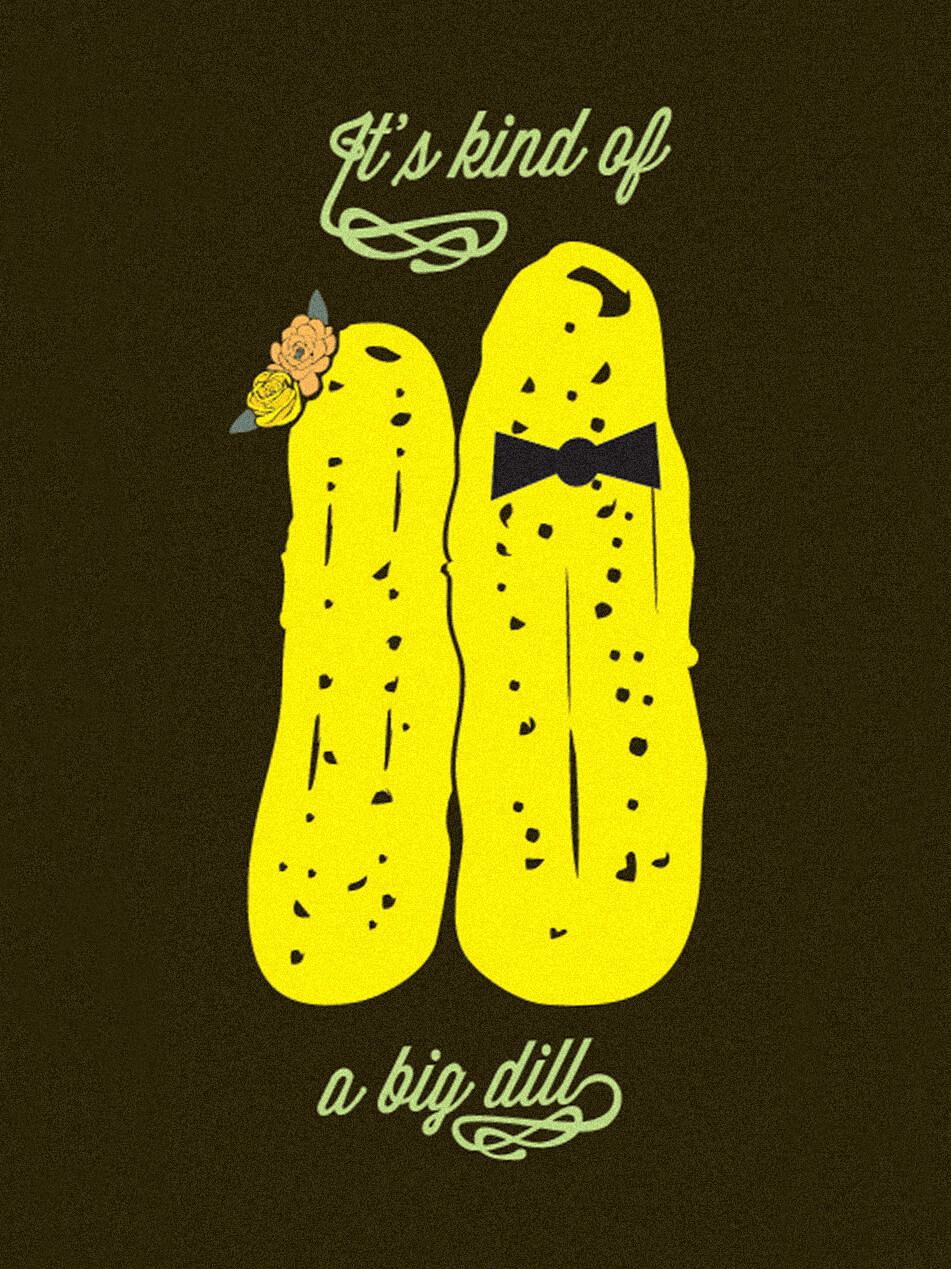
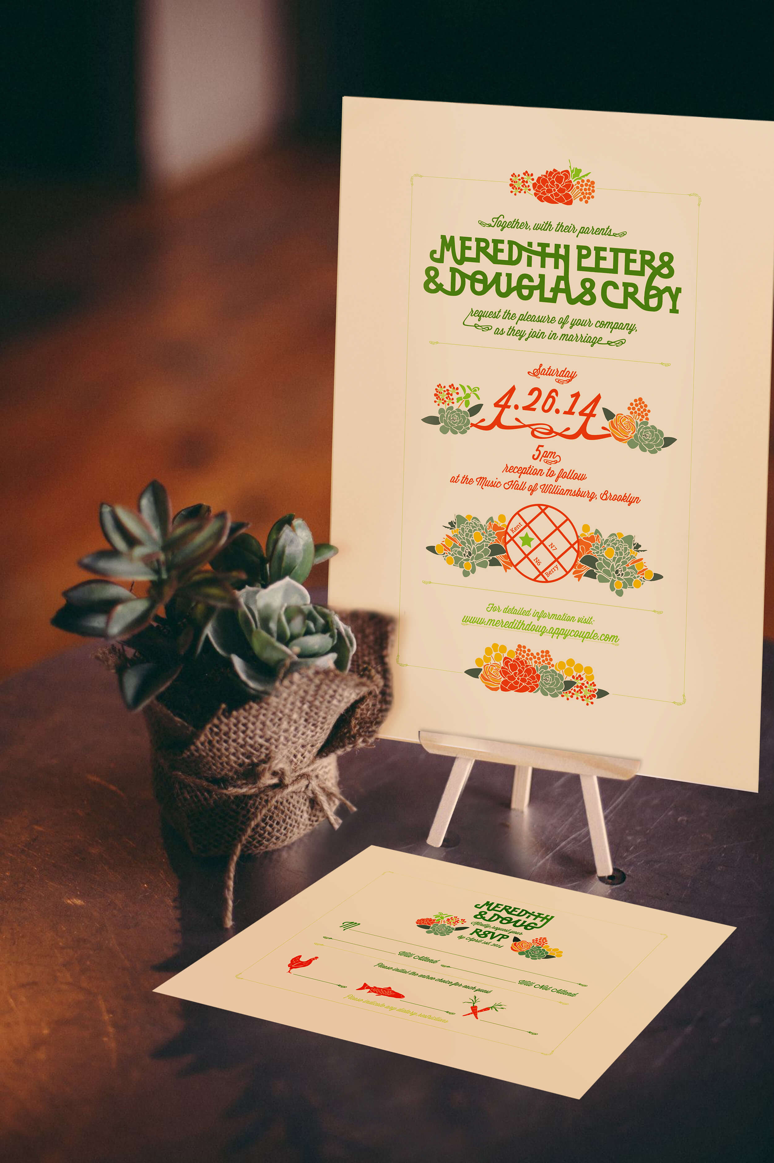
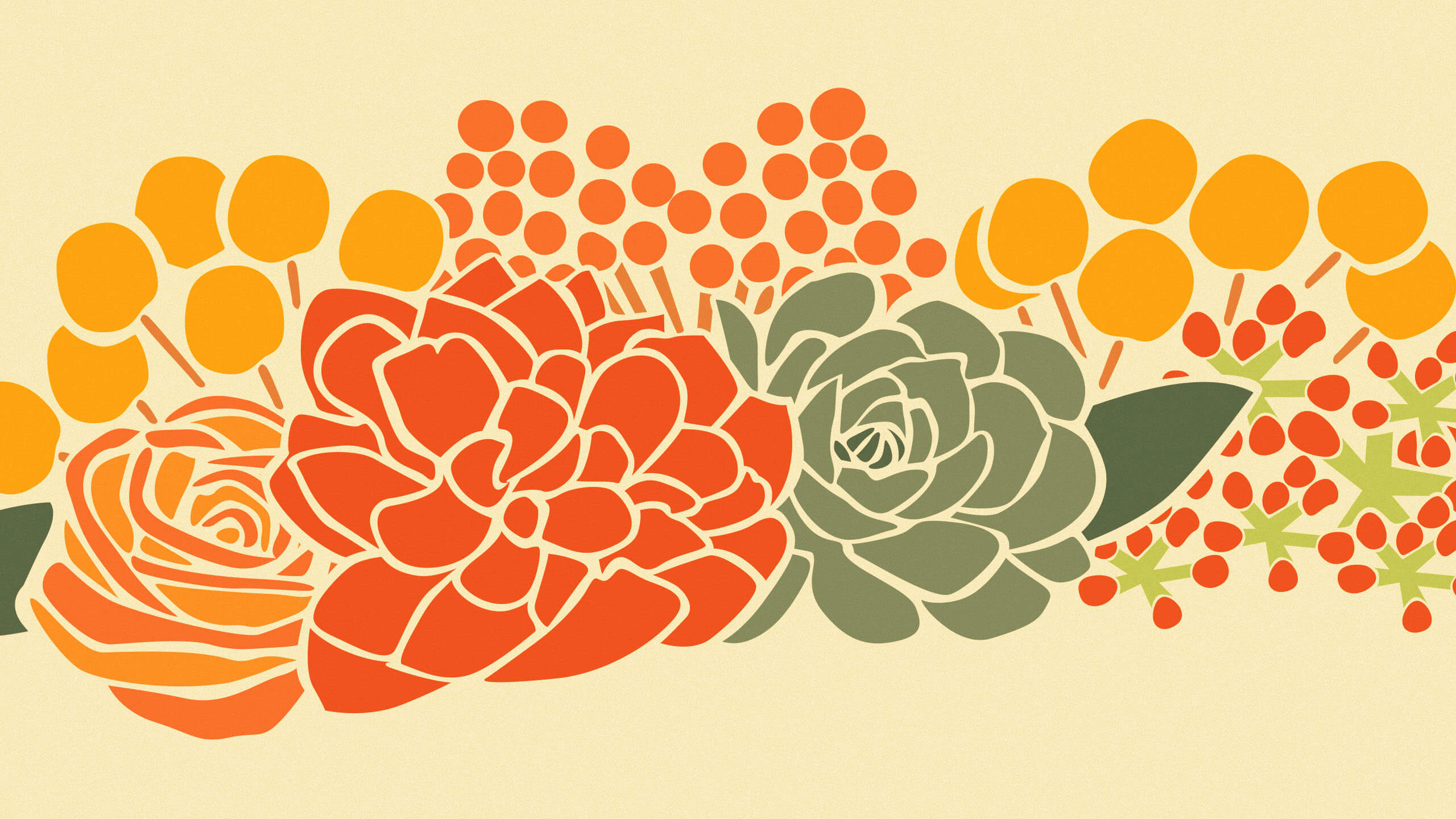
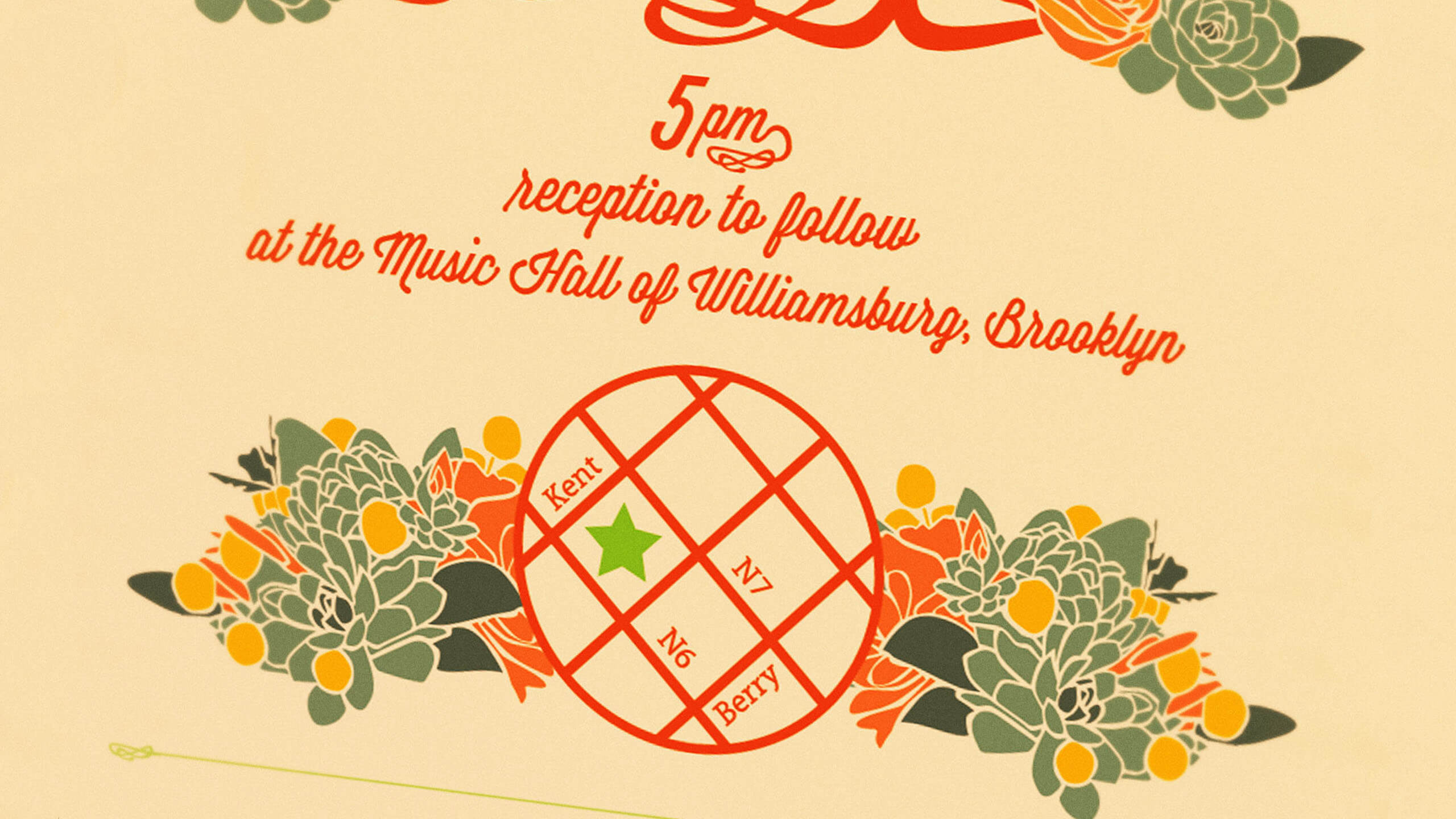
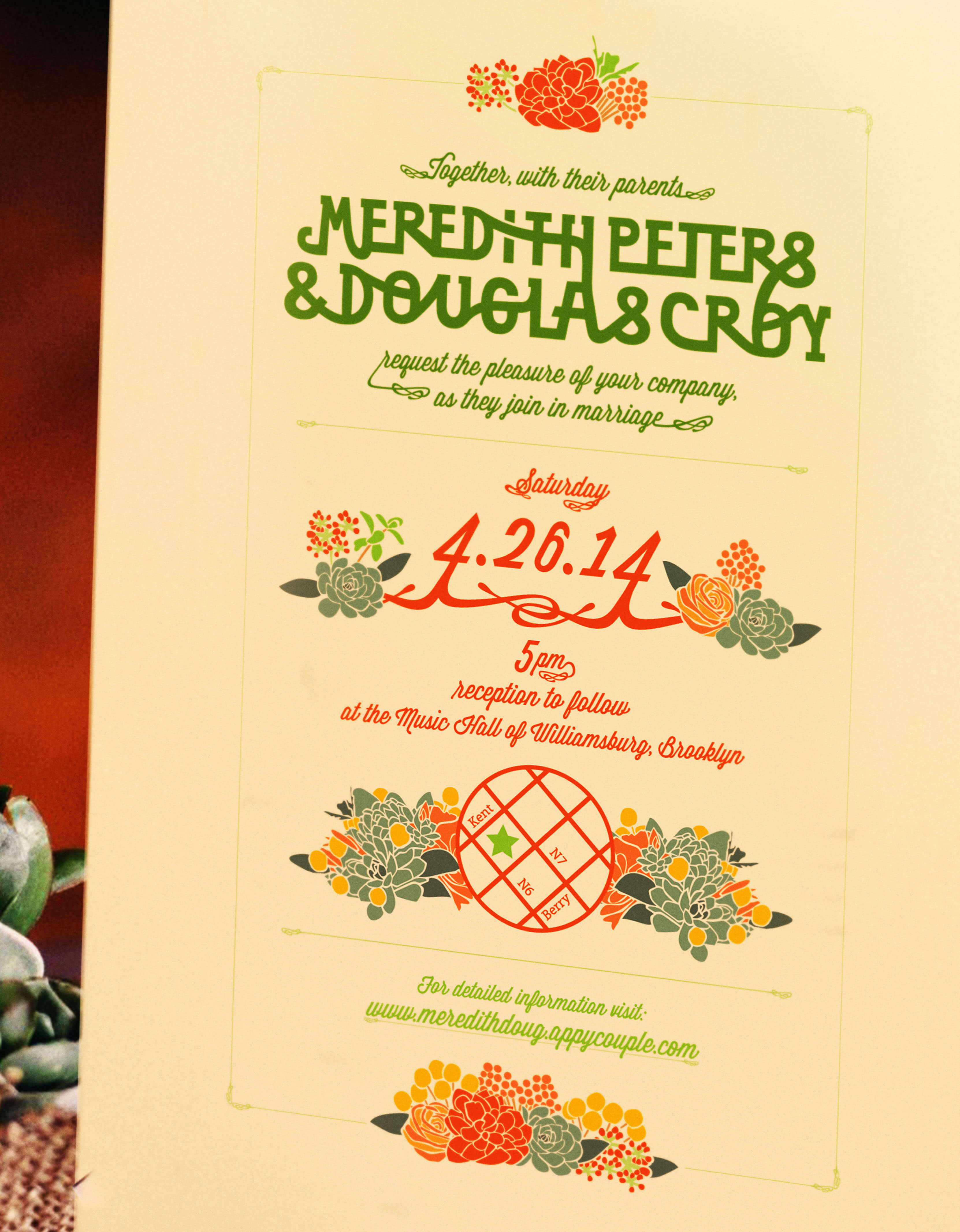
I designed these pieces for my friend’s wedding at Music Hall of Williamsburg. The couple met while booking bands at the Agency Group and went on to the Windish Agency where they booked bands such as Ra Ra Riot and Icona Pop. We wanted the invitations to reflect their fundamentally cool personalities and feel formal and beautiful yet to also have a whimsical and crafted vibe.
Save The Dates
We wanted to create an eye catching design for the Save the Dates. Meredith and Doug love pickles so we used that to add a little humor to the piece as well.
Wedding Invitations
Doug wanted to go a bit more formal for the invites so we took the color from dark to light. We kept the design sophisticated and added some more flowers.
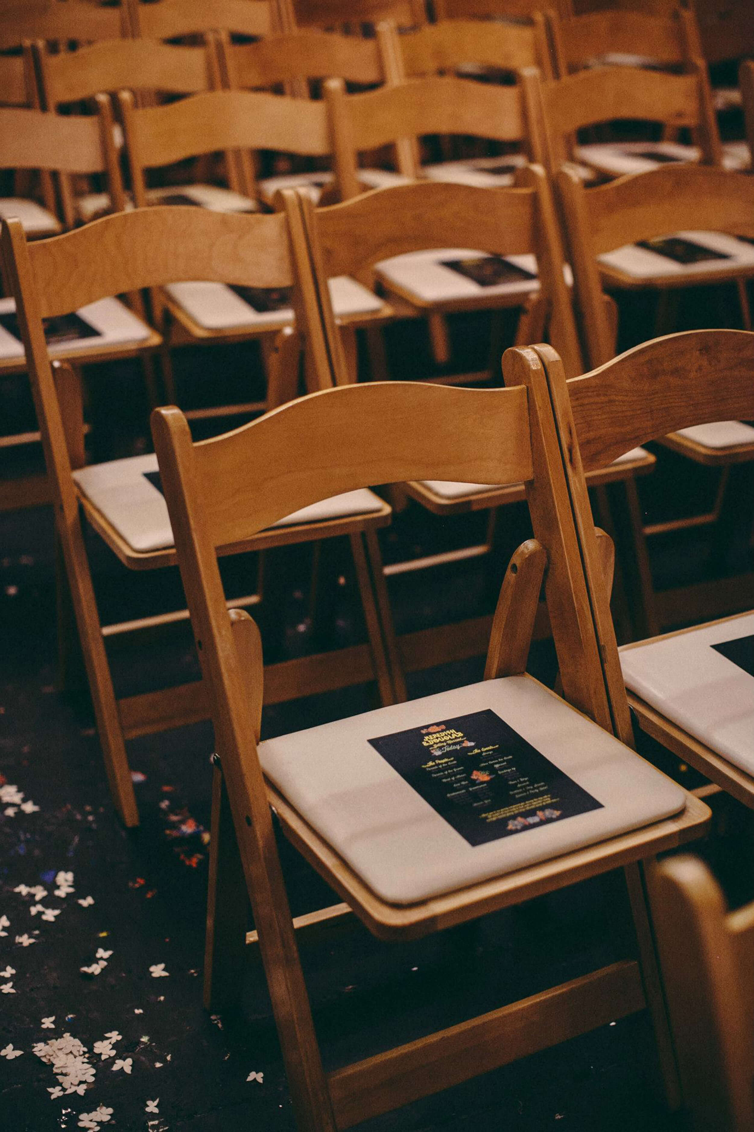
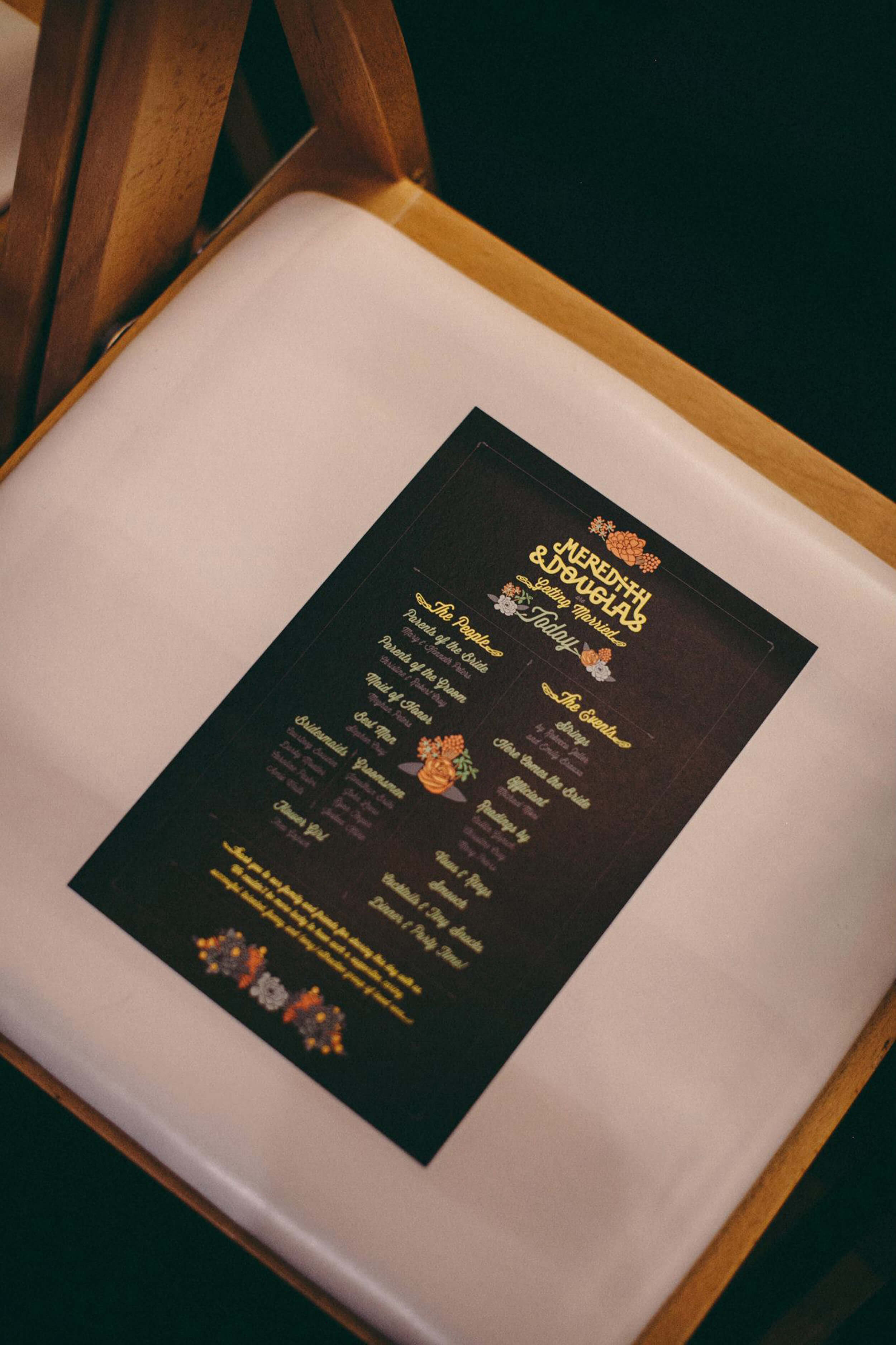
The Programs
The space where they got married is a music venue so it has a low lights vibe. Our programs reflected the space by going back to the dark background and creating some fun new elements.
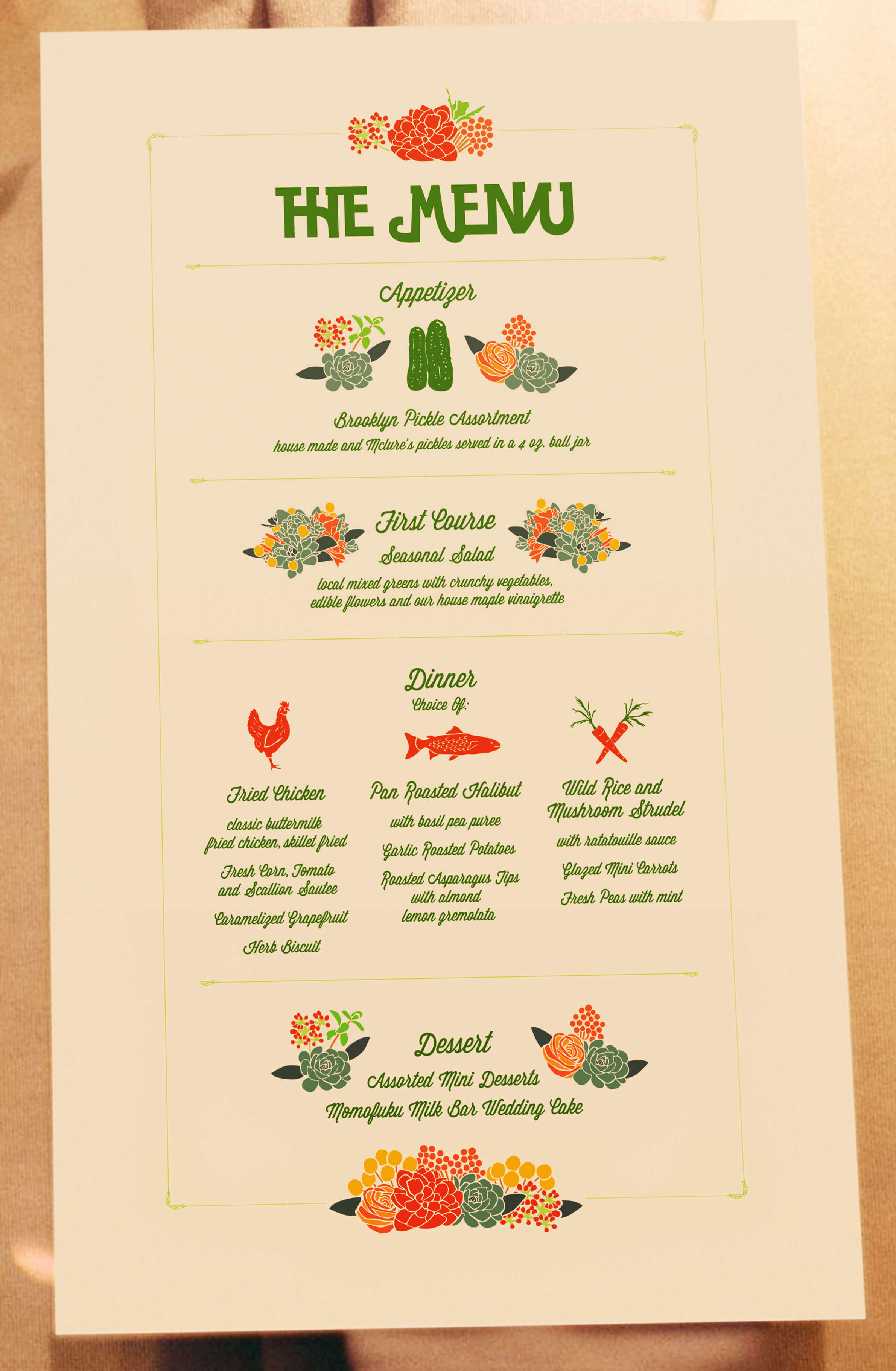
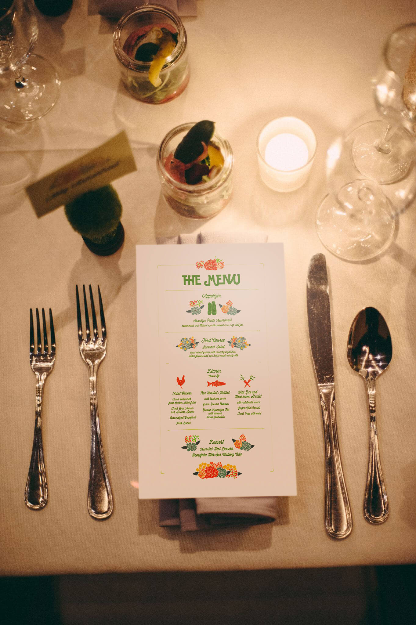
The Menu
For the menus we added some more elements and icons. All of the items worked together nicely as a unit and we were happy with the results.
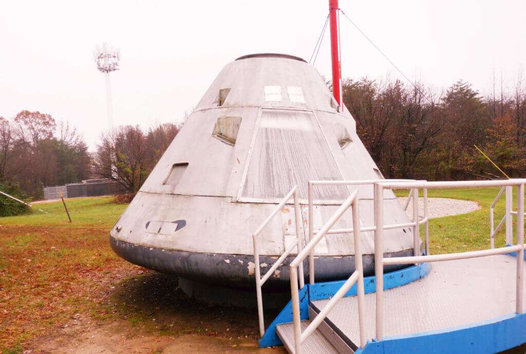
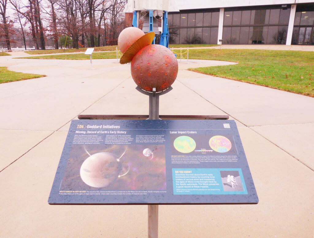
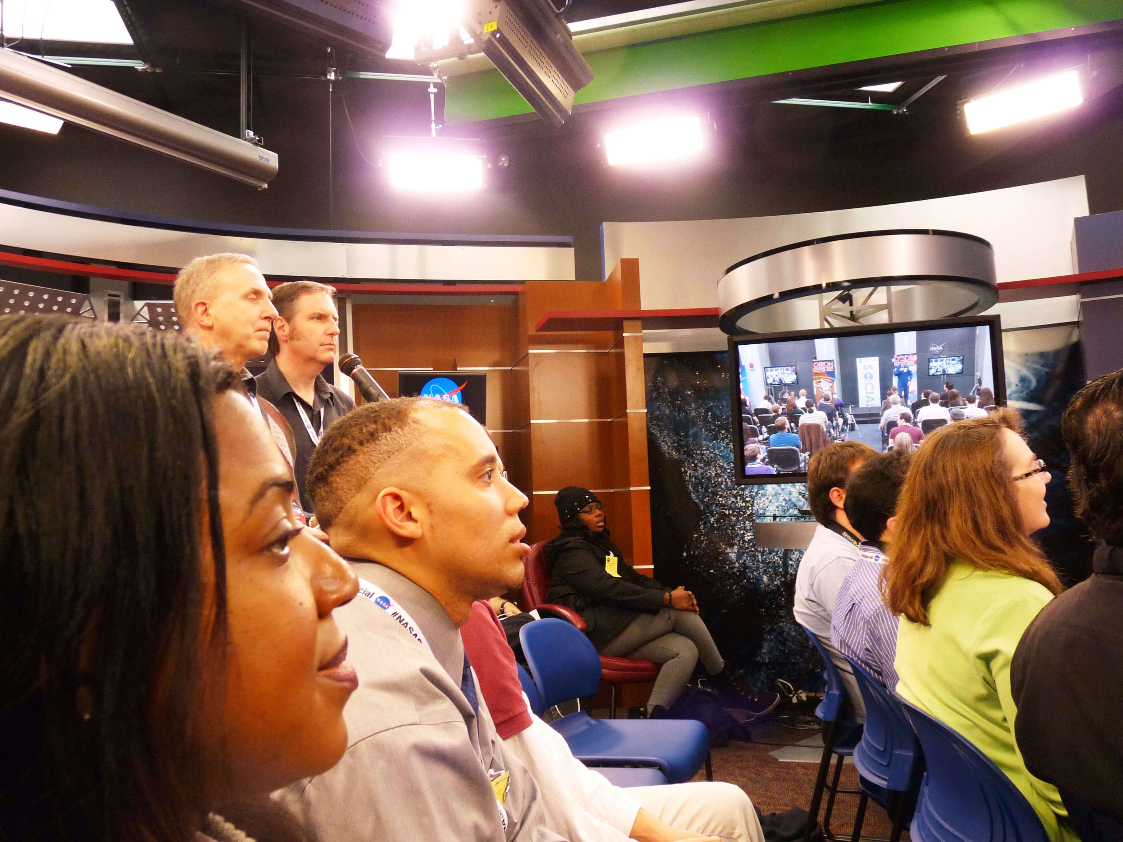
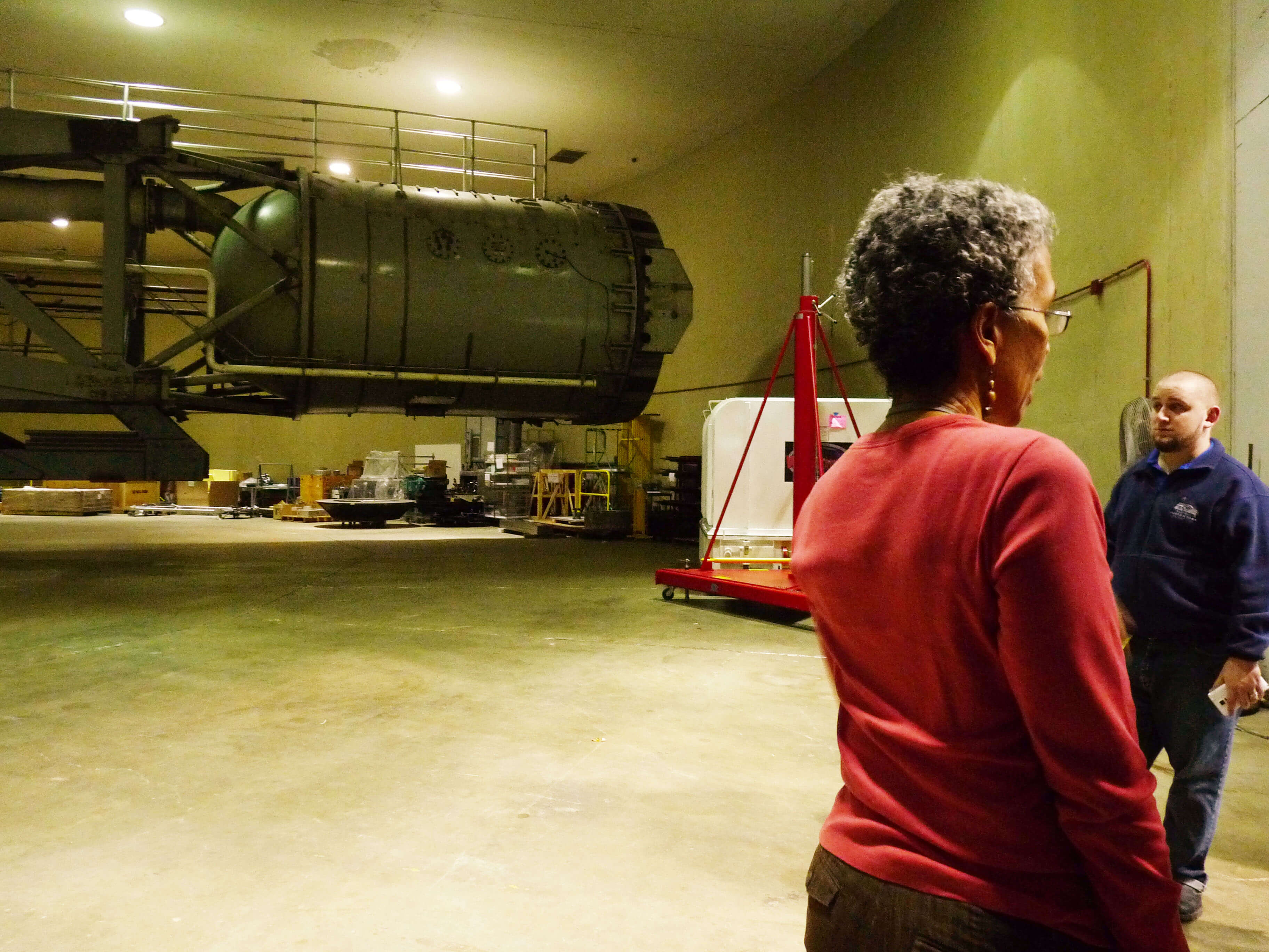
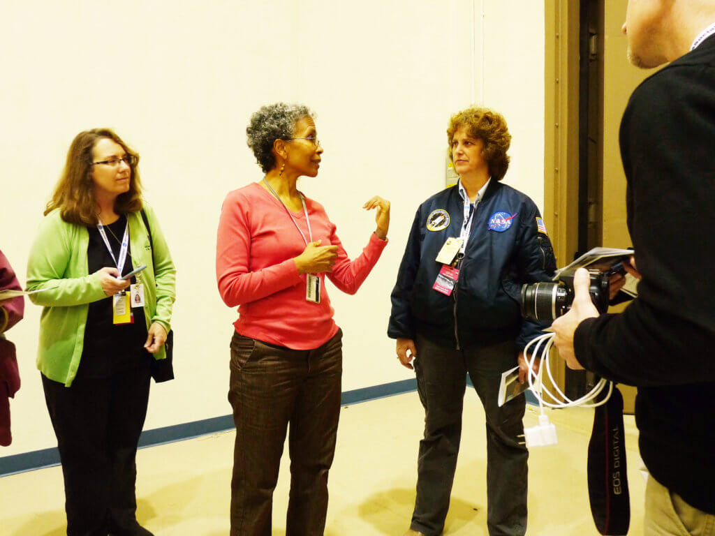
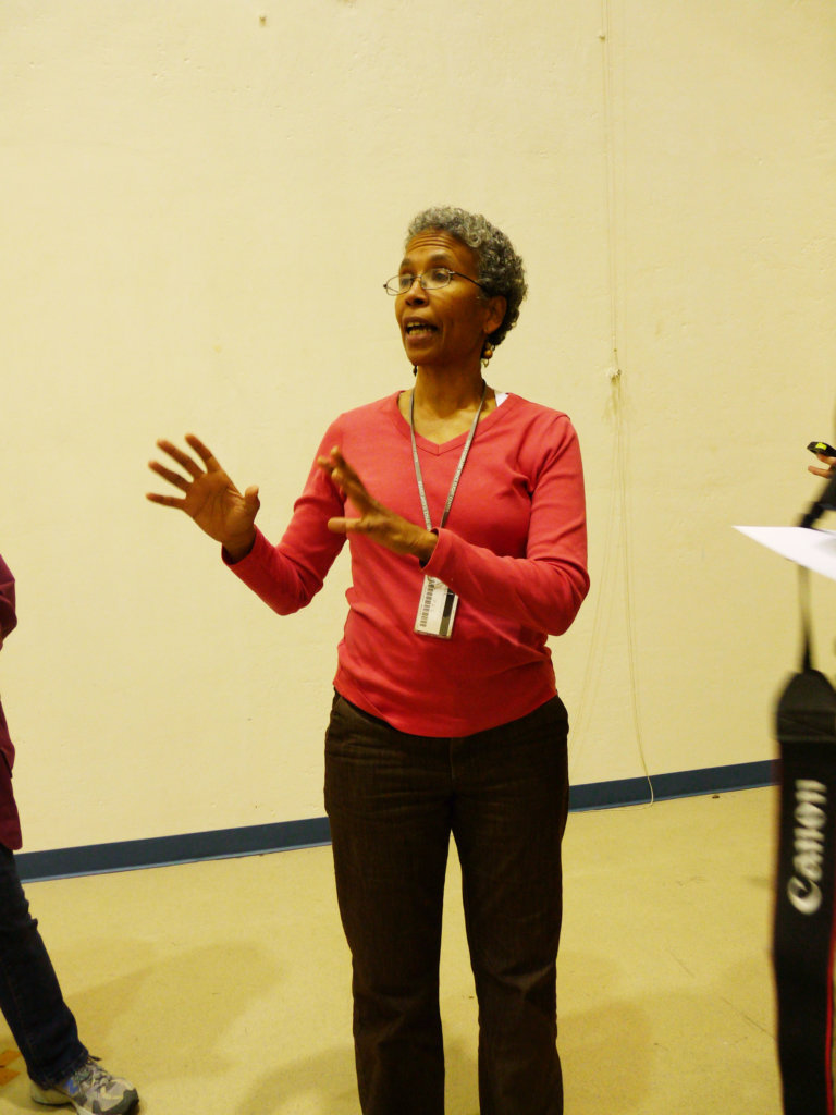
I was selected to a NASA Social Program which consisted of a one day trip and tour of Goddard in Maryland in celebration of the launch of Orian at Cape Canaveral. Before I went I made a Pinterest quiz for the visit, because that's my most popular social media platform: https://www.pinterest.com/mhlangsa/nasa/
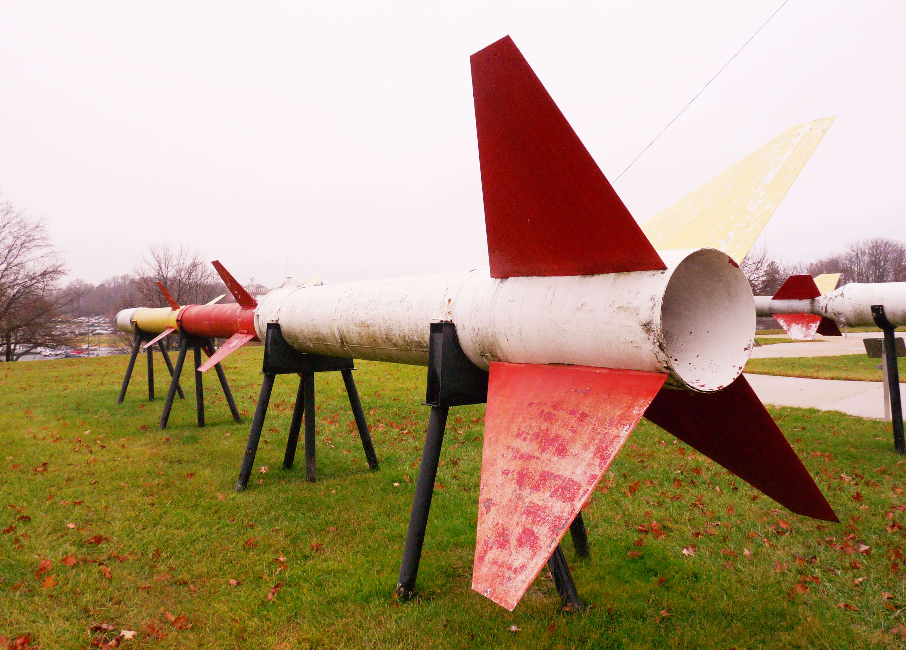
Sounding rockets are research tools used for direct atmospheric measurements and for a variety of experiments in space science. Every year NASA launches about 50 of them.
Here we were in a video broadcast connecting all of the NASA Social events around the country that day.
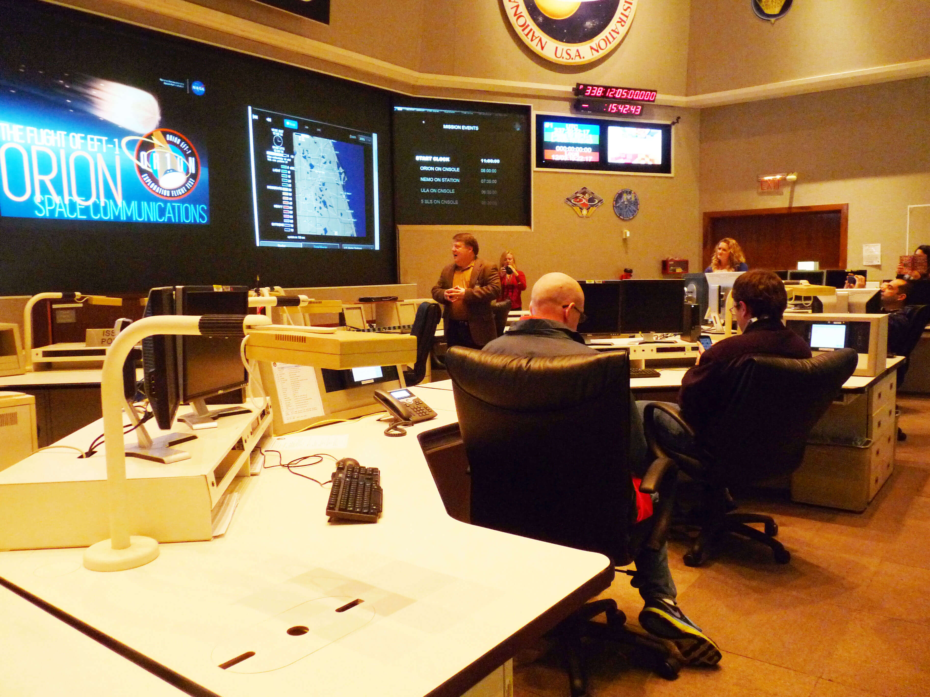
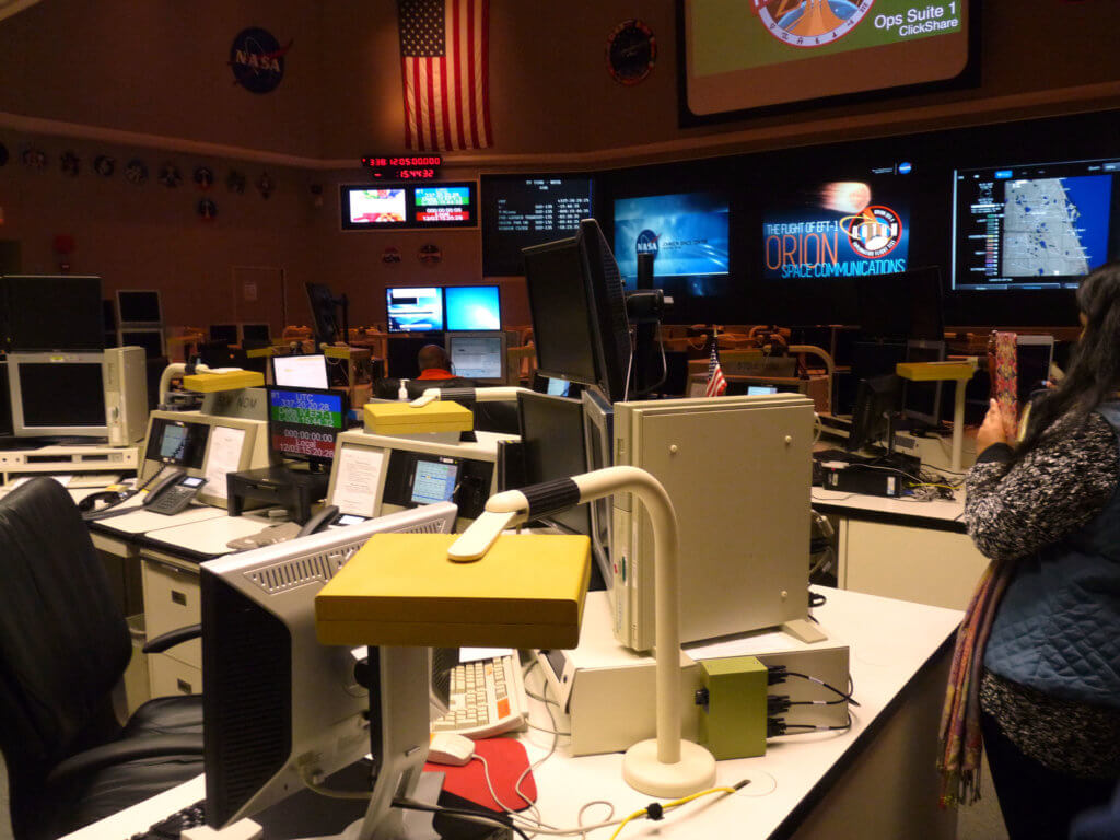
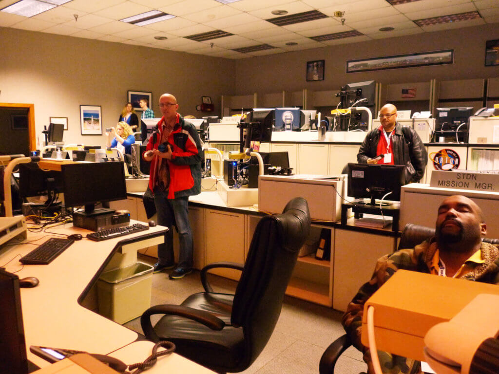
Networks Integration Center. Displays are configured for ground and tracking and data relay satellite, TDRS communications for the Orion EFT-1.
The Astrobiology Analytical Laboratory where we had a discussion about the research into meteorites, other extraterrestrial samples and analogs as well as NASA's work in support of missions such as twitter.com/OSIRISREx asteroid sample return.
"This is the oldest thing you will ever hold." Said Jamie Elsila Cook, an astrochemistry research scientist. She estimated this meteorite was approximately 4 billion years old.
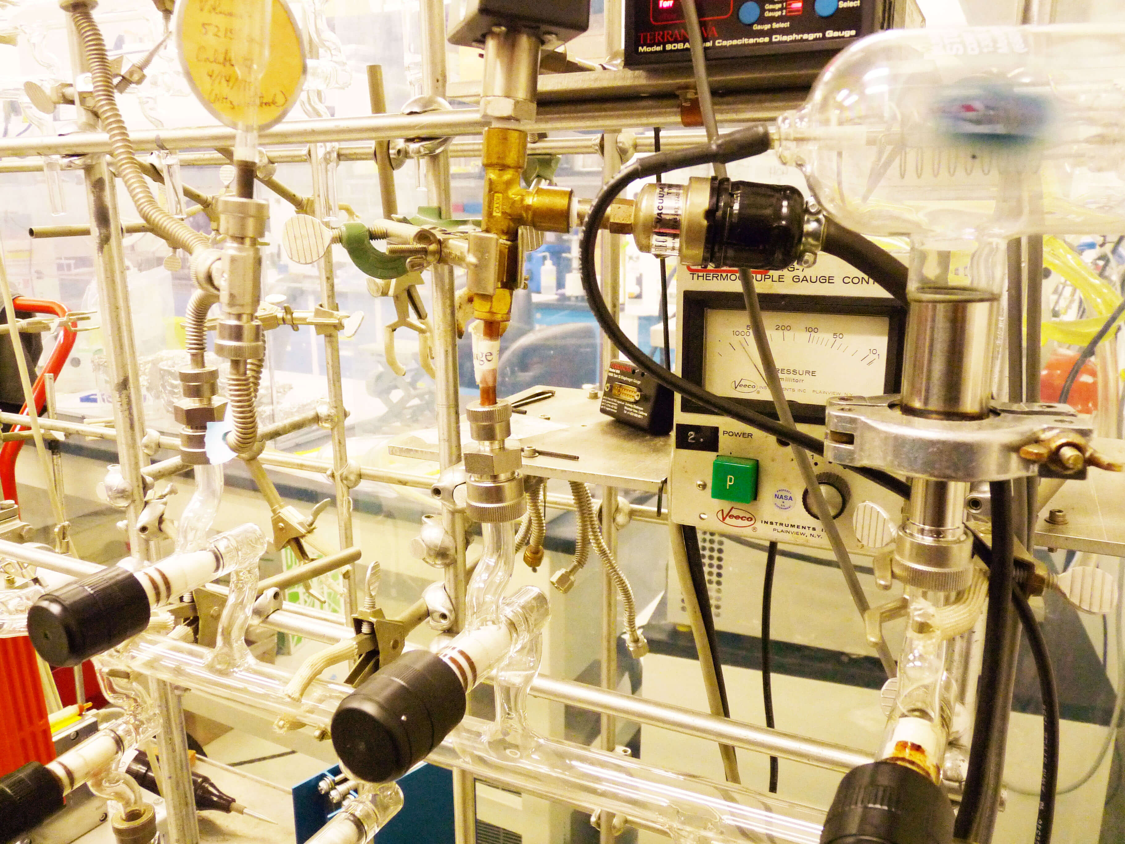
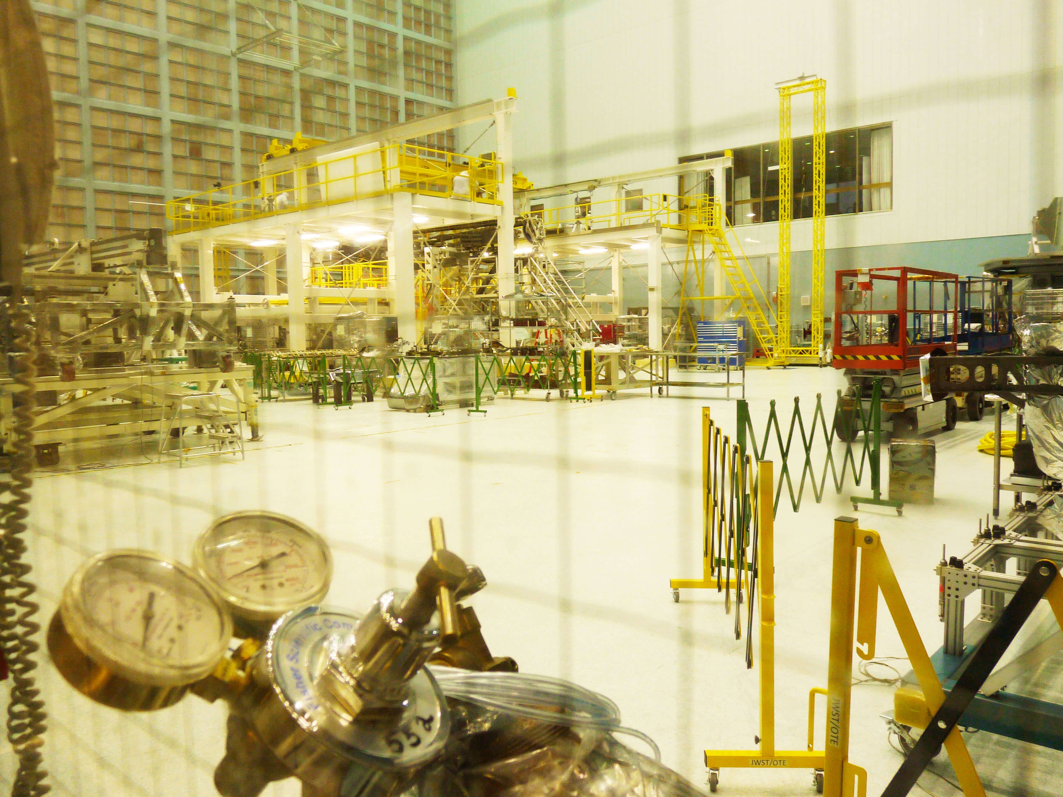
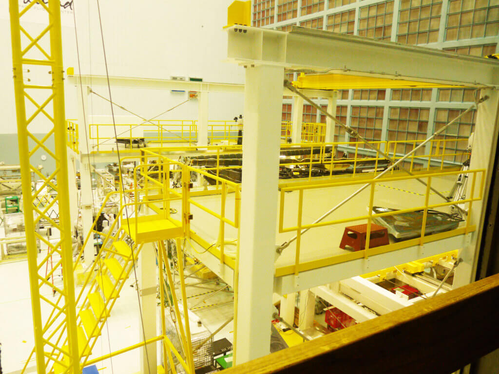
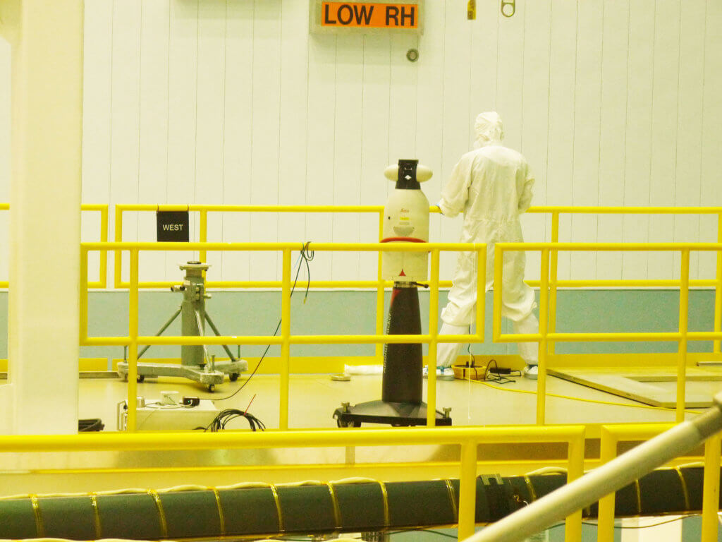
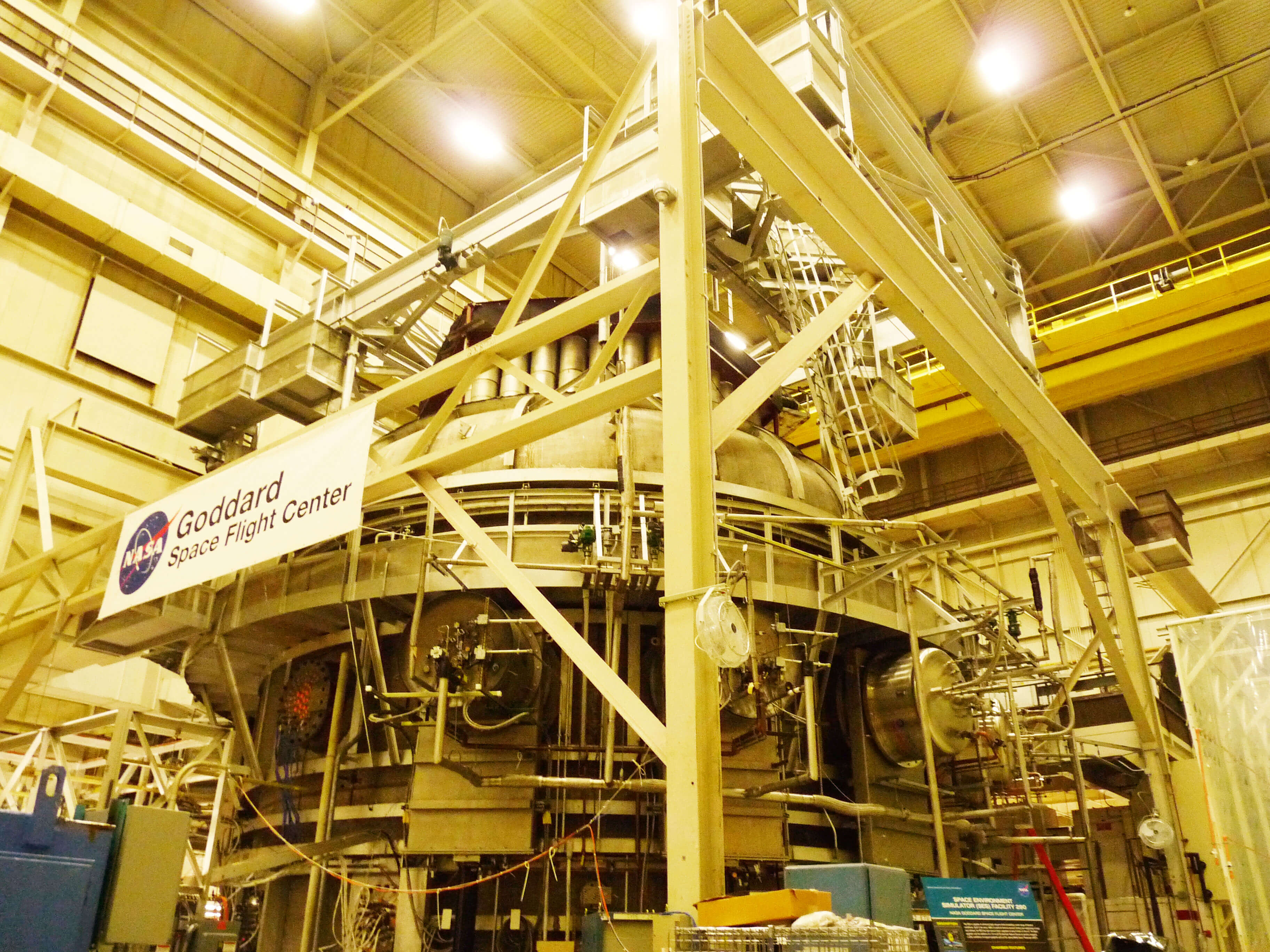
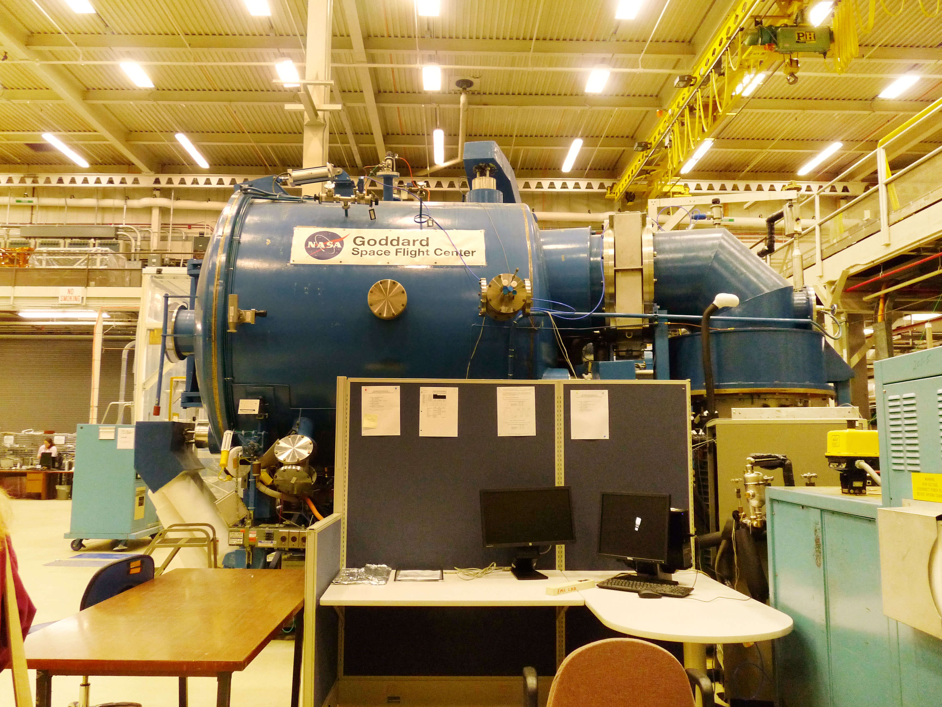
The High Bay Cleanroom is the world's largest publicly known ISO 7 cleanroom with 1.3 million cubic feet of space. At the time was where the pathfinder components of the James Webb Space Telescope were being assembled.
Janet Thomas, an environmental testing engineer, showed us the satellite Testing and Integration Facility. We got an overview of vibration, acoustics, the thermal vacuum chamber & high-capacity centrifuge, which can generate 30 G on up to a 2.5 tons load.
Aside from removing all but the smallest trace of air, Goddard's Thermal Vacuum Chamber can chill a payload down to minus 310 F, or heat it to a sizzling 302 F.
I created a number of logos to present to The Musary which is a musical instrument lending library nonprofit. Here you'll see my initial concepts that I presented to the organization, however if you want to see the final work, visit the Musary project page here.
Playable Logo:The Musary mission is big, to inspire people to “play on.” So we created a logo that does just that. We present to you the world’s first “playable” logo. More than just a logo, it is also an interactive piece that encourages and inspires people to play on. Here’s how it works: We’ll compose a Musary logo that works on multiple dimensions. Typographically, it will be a fun, whimsical yet structured piece that clearly communicates “The Musary.” Simultaneously, musical notes will be embedded into the type while also plotted against a music sheet. But beyond the words “The Musary”, this logo can actually be practiced and played by musicians everywhere.
No Strings Attached: The logo was handcrafted using Martin 41M1100 Marquis LT Acoustic Guitar Strings. The font is playful while also delicate and sophisticated symbolizing the care and attention that goes into The Musary process. The colors are copper with a gradient sheen that makes the letters feel metallic and dimensional to mimic guitar strings.
Energy: The logo started with a very structured powerful sans serif font, yet the corners have been manipulated to give the lettering movement and vibrancy. It is a strong mark that will be represented through bright bold intense colors. This logo screams sound without making a peep. The elements over the “U” were inspired by John’s prized instrument the drum and evokes both the blast of a drum beat and a bolt of noise honoring The Musary musicians. It is a powerful symbol.
Music Library: The fun part of the logo is the clever symbol that is both the silhouette of a book and a bended music note standing for "Music Lending Library".
Sound: While, the logo intentionally feels techy, it is 100% hand crafted for The Musary, built in sync with the sound waves. The waves are a stylized interpretation of sinusoidal sound waves which mathematically allude to repetition, flow and eternity.
Cultivating: The logo mark can be seen two ways: both as distorted sheet music and simultaneously as a field with growing plants. The dichotomy is a beautiful representation of both what The Musary does, by providing tools to create music and what The Musary does metaphorically, by cultivating the growth and creation of music
Here were even more options I created initially.
And the winner was!
This was the logo that we netted out with which was a combination of Playable Logo and Energy.
To see more about the final logo and more of my Musary work, click on the project page.
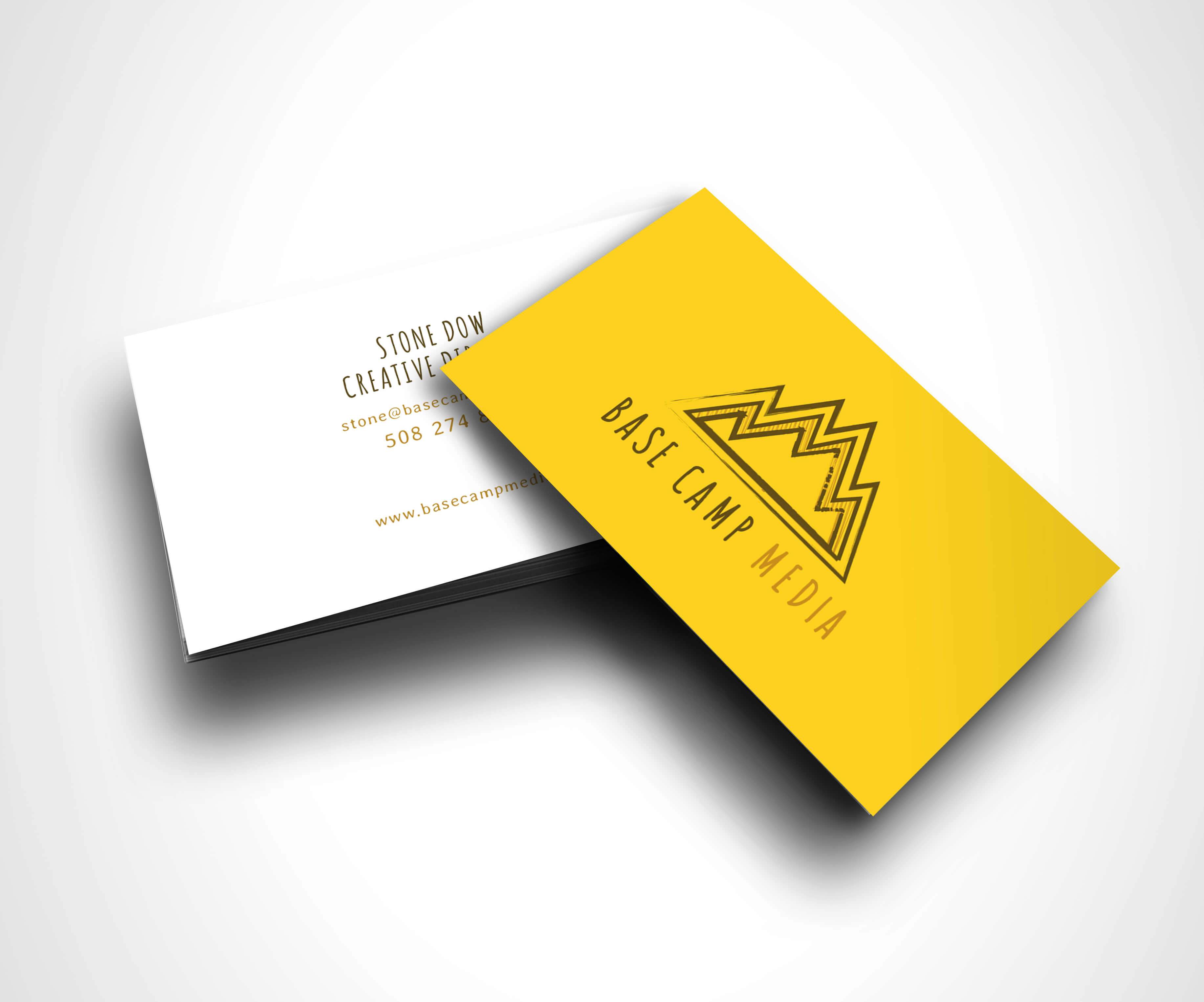
Some friends started a video production company and I helped them by creating their branding. The duo were young and smart and loved telling stories through film, video, etc. While they lived in Brooklyn many of their clients were in D.C. and were more corporate. So, they wanted to create materials that represented them but did not turn off clients who would be looking for a buttoned-up partner. They were in the beginning stages of their business and the future held exciting possibilities. With their new logo and branding they were ready to hit the ground running.The concept of camping and adventure makes for an imaginative logo exploratory. I created a number of options to present to the team:
Basecamp has a hip, industrious, go-getter vibe. For this logo I wanted to create something inspired by old school sports pendant design.
This logo has the right mix of hip and sophisticated with the modern lockup and structured serif font.
The elements on this badge are metaphorical: Basecamp guides their clients in telling stories and in the symbols in the logo are guidance tools such as maps and compasses while in the center sits a comfortable home base.
In this logo the text is congruous with the mountain. It feels like no matter where the client is in their journey, Basecamp is there at every point to help along the way.
The "M" of camp and media conjoin and create a symbol of a mountain. This is an innovative way to look at the logo structure for Basecamp.
The rustic nature of the screen printed font and pine trees feel fresh but the font is structured enough so it will look professional and inviting to clients.
And the winner was!
Basecamp tells client stories about clients' struggles and achievements, the cascading ridges and woodcut feel represents that.
We also created business cards for the Base Camp team.
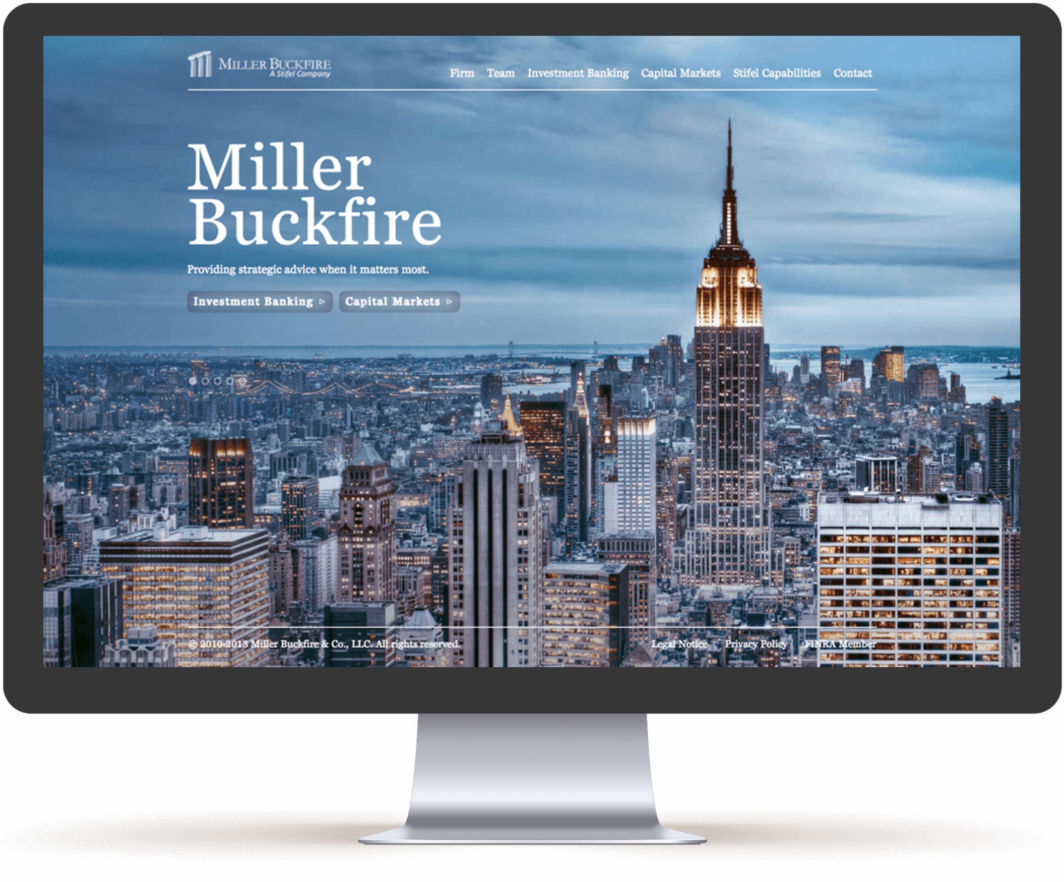
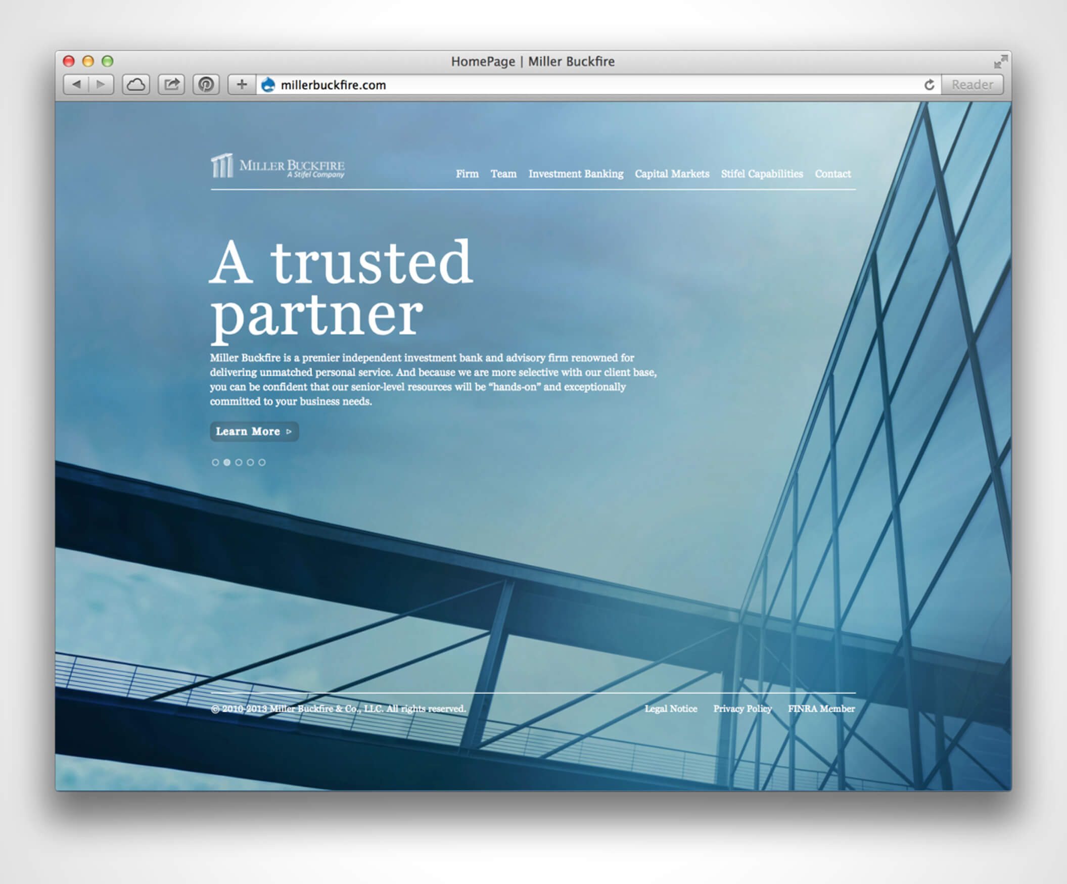
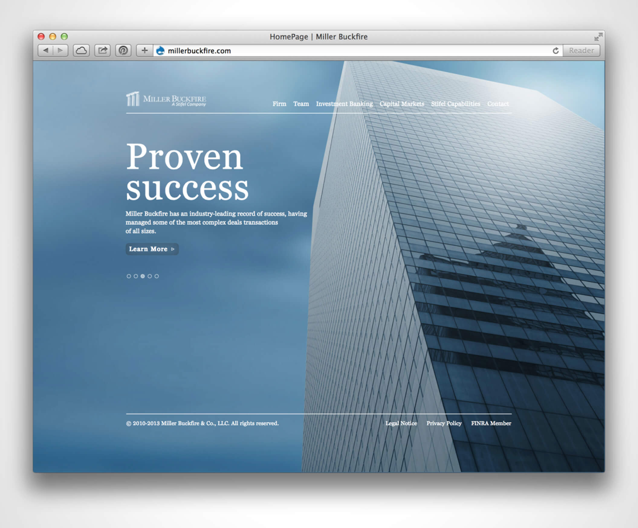
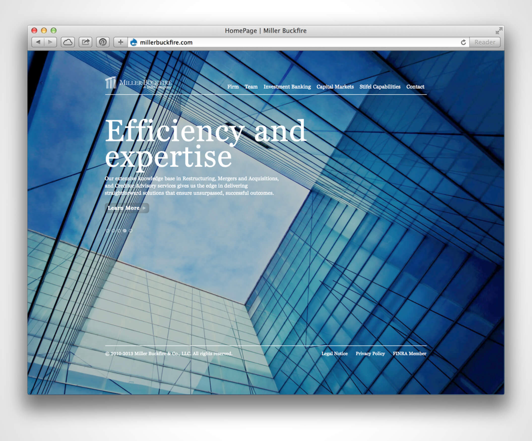
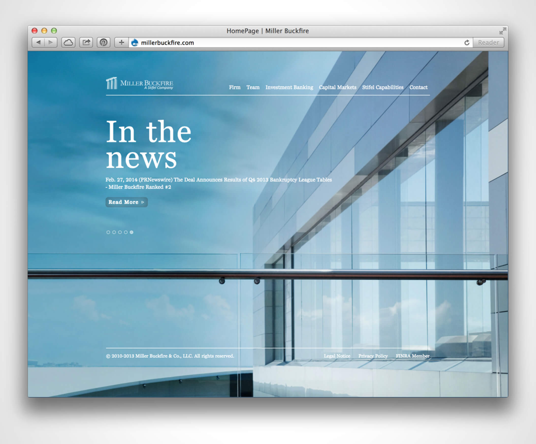
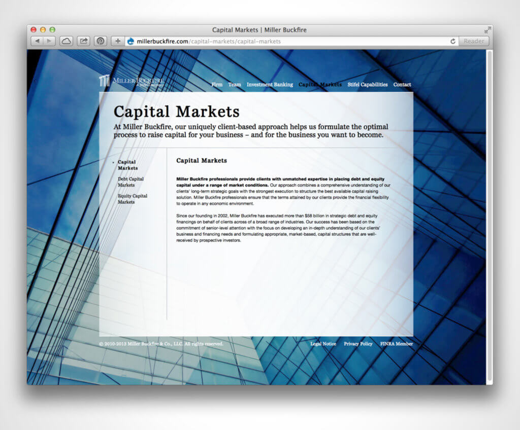
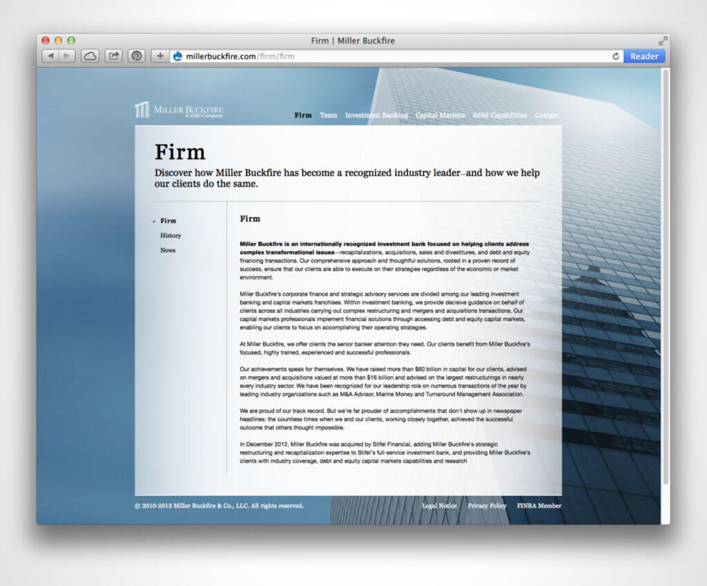
When I was at Launchpad I designed this website for the financial company Miller Buckfire. The company was in need of a site redesign. We wanted to create a simplistic but sophisticated look using rotating shots of New York based architecture as the wallpaper background. To see the site click here.
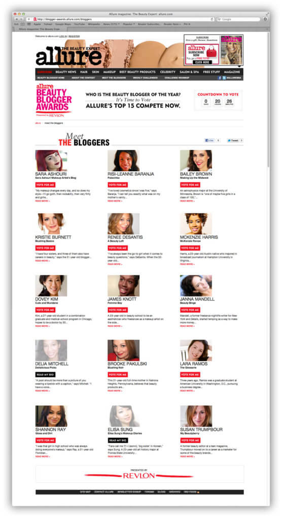
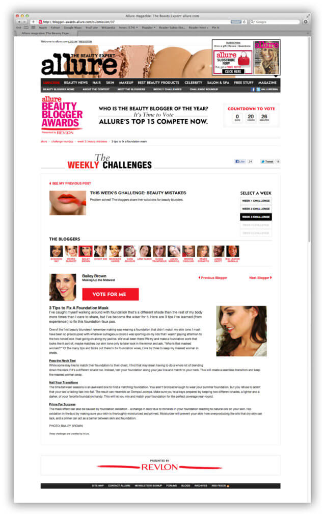
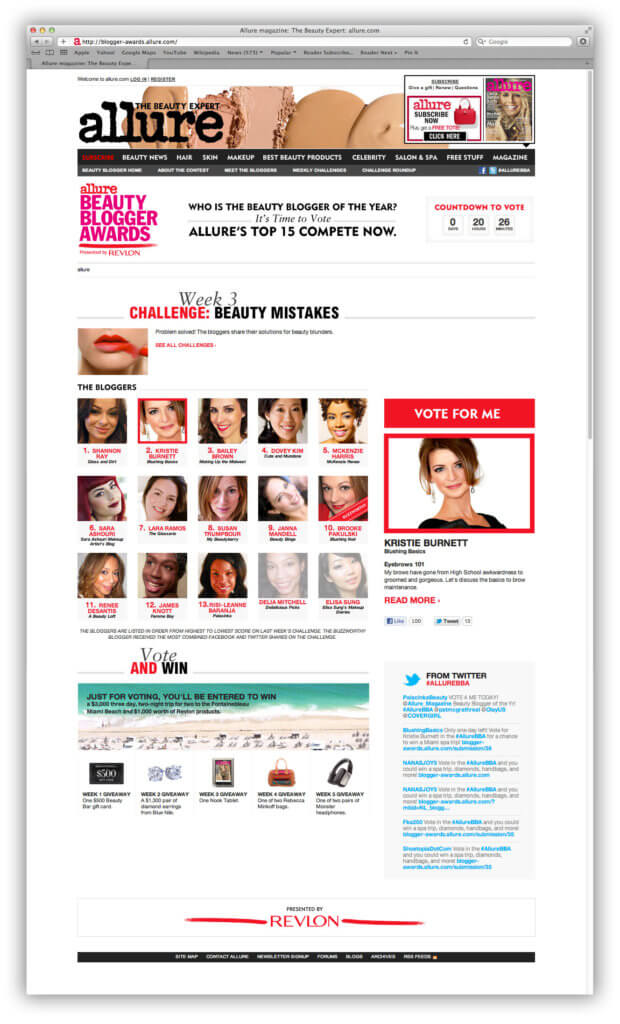
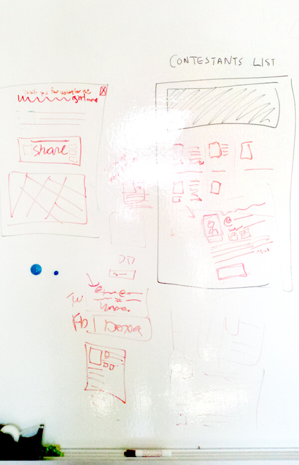
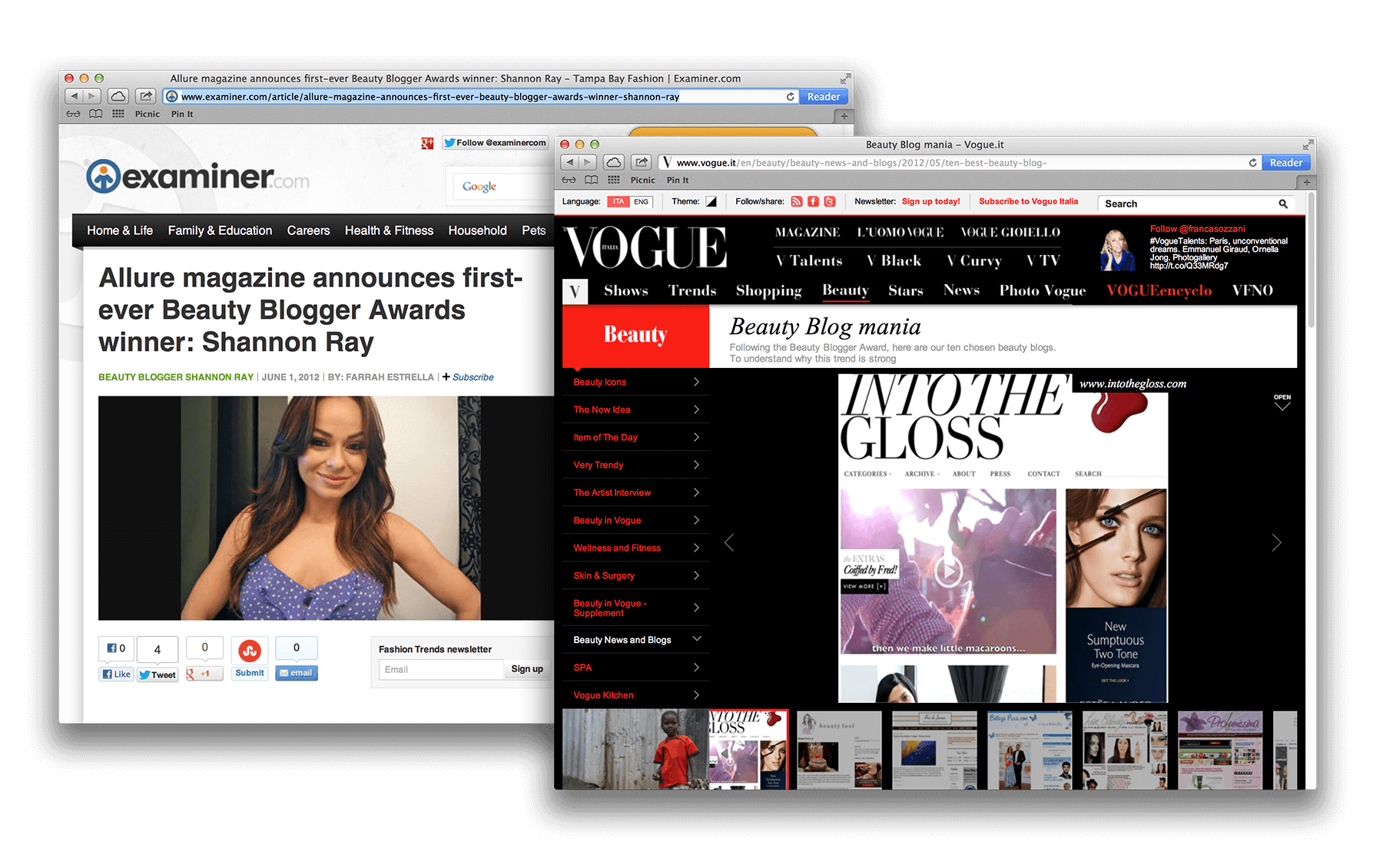
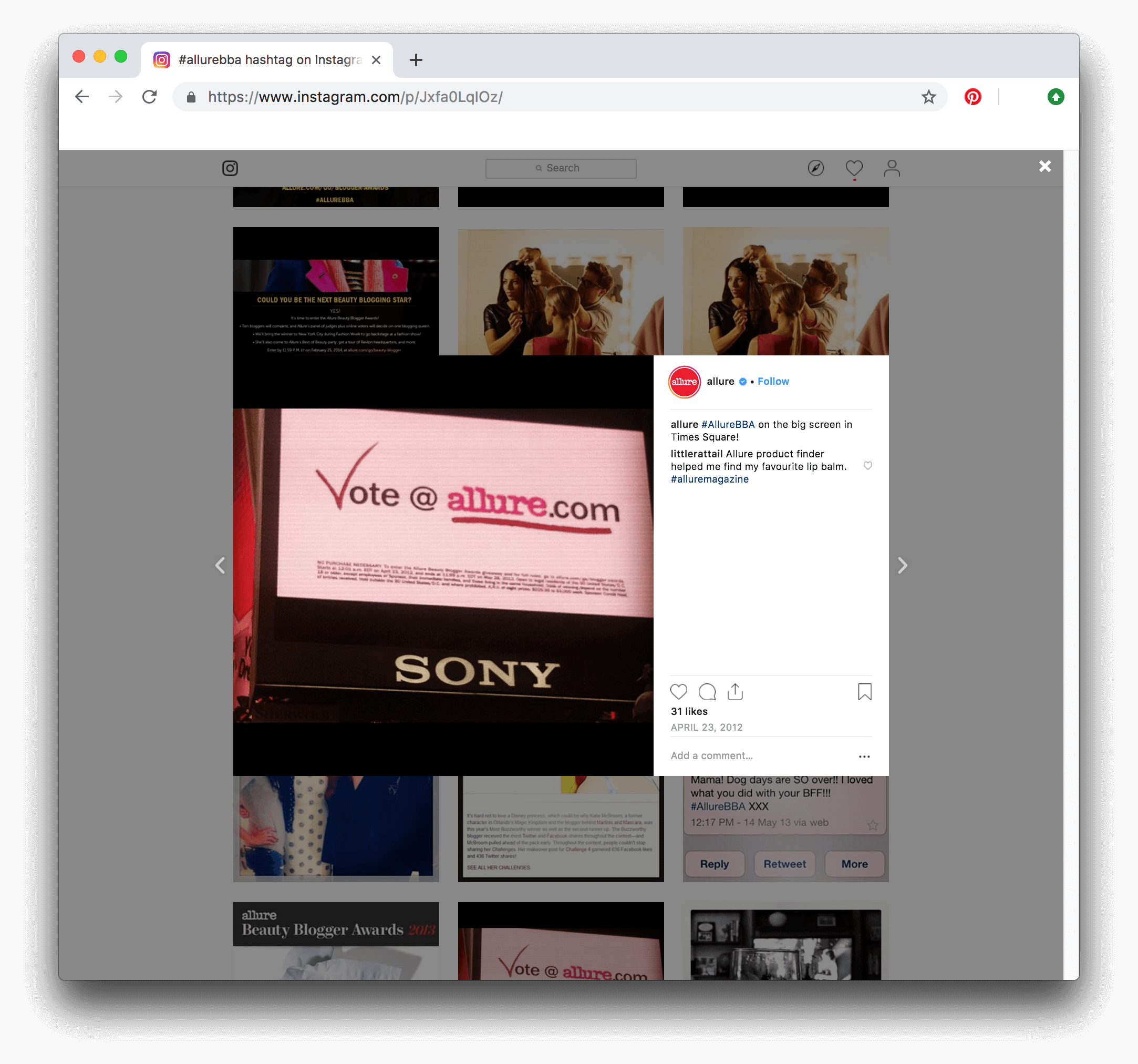
At Launchpad I helped create the first annual Allure beauty blogger website. An initiative by Allure to engage users socially by allowing them to vote and win prizes. Art Directors: Miriam Langsam; Mariam Guessous
Nantucket cranberry bog harvests are a staple of the Massachusetts autumns. Nantucket Cranberries are grown on the island of Nantucket by the Non-profit Nantucket Conservation Foundation. These Early Black and Howes varieties of cranberries are known for their rich color and high sugar/acid ratio and they are not harvested until they are at their peak of ripeness. Nantucket Cranberries are one of the largest producer of cranberries from the Northeast. The group was looking to update their logo and I thought it should feel fresh. I went for a variety of looks to give them options on the direction they'd want to take their brand.
This logo option is a classic crafty food-style logo. It has the feel of a logo that would represent a booth in a farmers market.
The outer dotted circle represents cranberries. The rest of the logo uses basic shapes are fonts to represent Nantucket cranberries.
Using funky shapes and colors we highlight the glory of the cranberry in this design.
Wet harvesting makes cranberries rise to the surface, so we created a cranberry bog in the shape of Nantucket.
This logo cleverly uses the cranberries in the shape of a “B” and the leaves in the shape of a “U.”
And the winner was!
Inspired by images of the bog in Nantucket, the red in the near side of the foreshortening represents the cranberries when they float to the surface during wet harvest season.
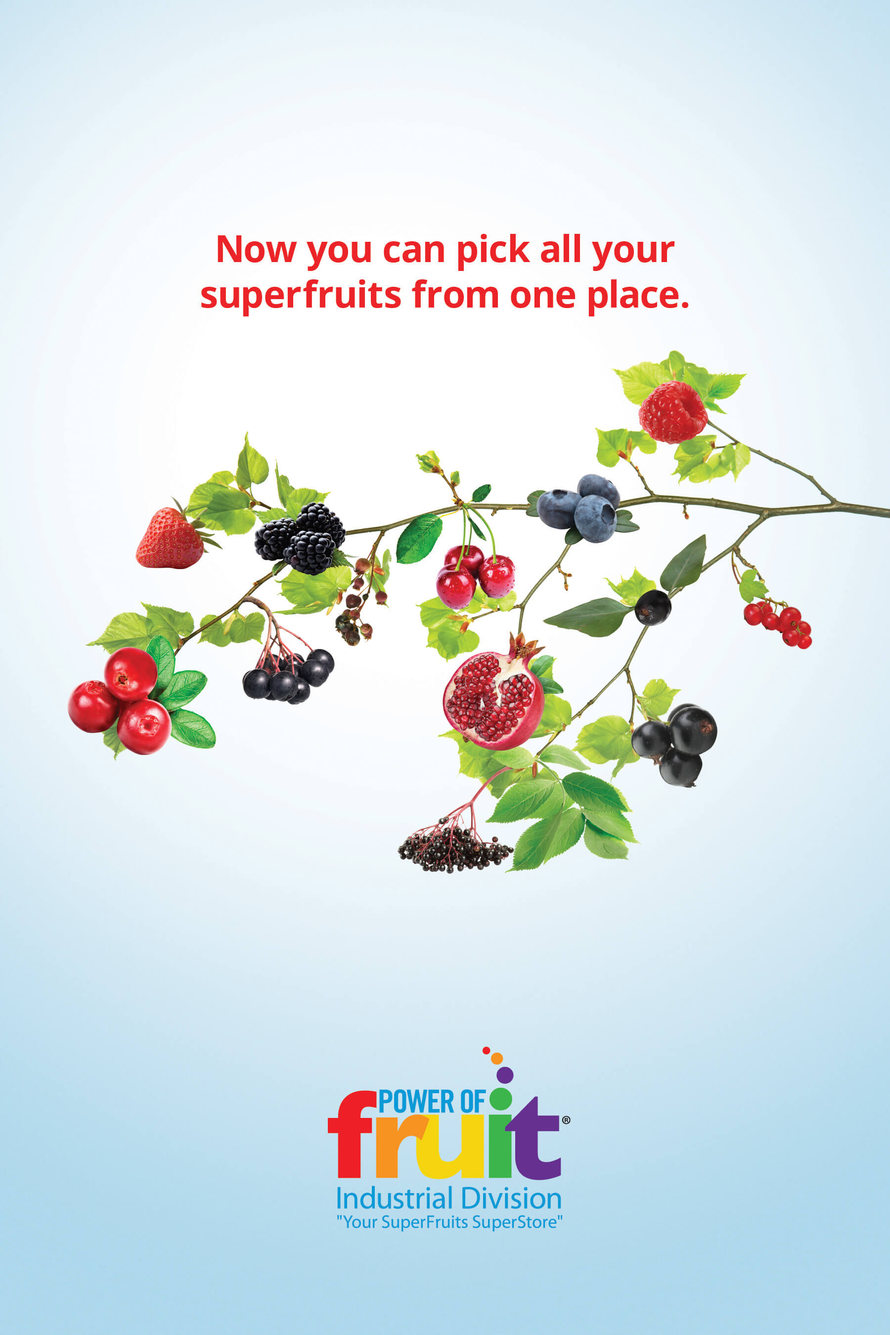
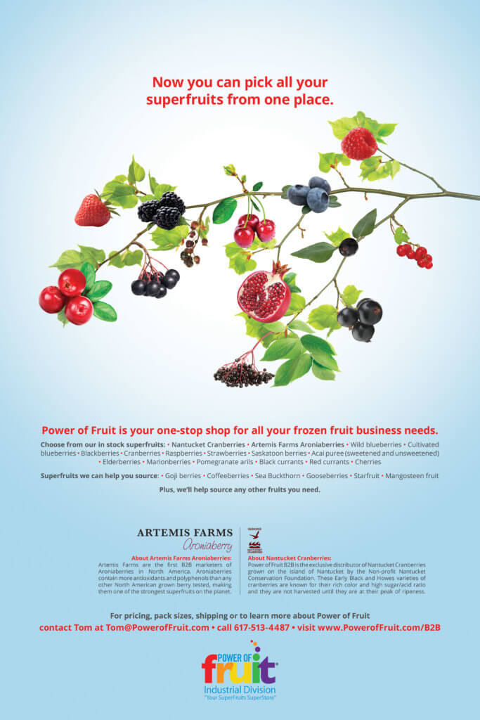
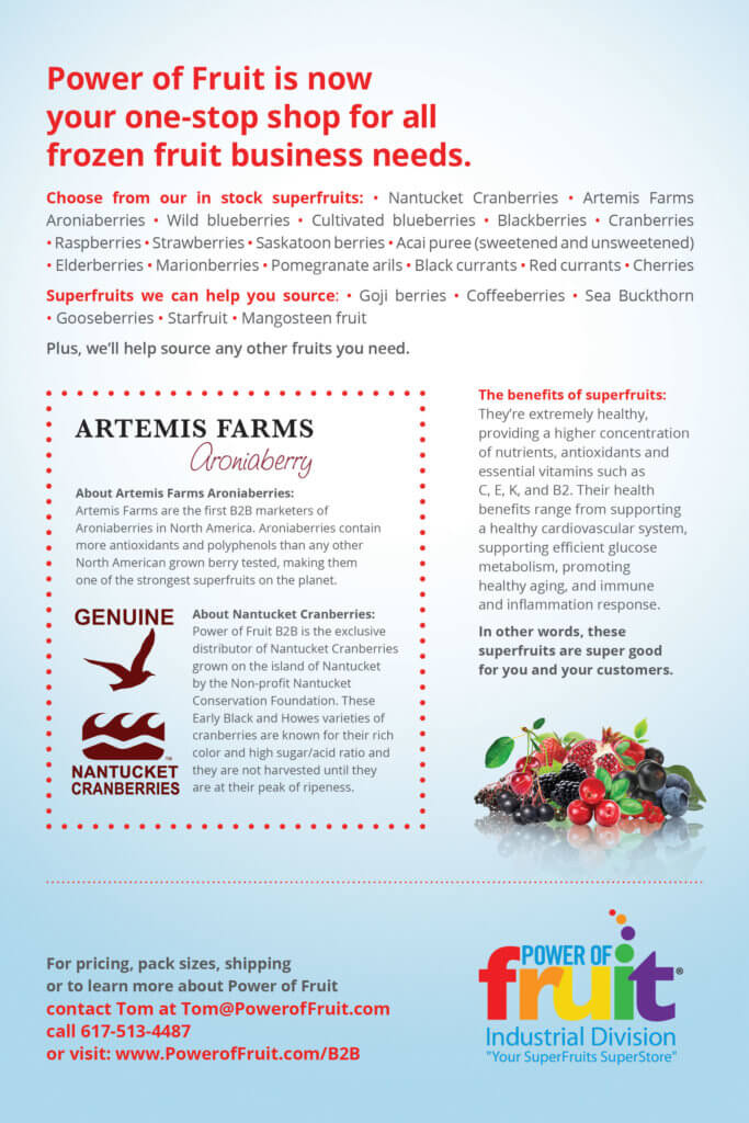
Power of Fruit
Power of Fruit B2B is the exclusive distributor of Nantucket Cranberries and is a one-stop shop for all frozen fruit business needs. As they were a partner company of Nantucket Cranberries, we helped designed assets for one of their trade show.
While I was working at Ogilvy I created the Girlfriends for folate logo. It was designed to raise awareness of the importance folate plays in a young women's life who is either pregnant or even considering getting pregnant. Vanessa Manillo was the spokesperson.
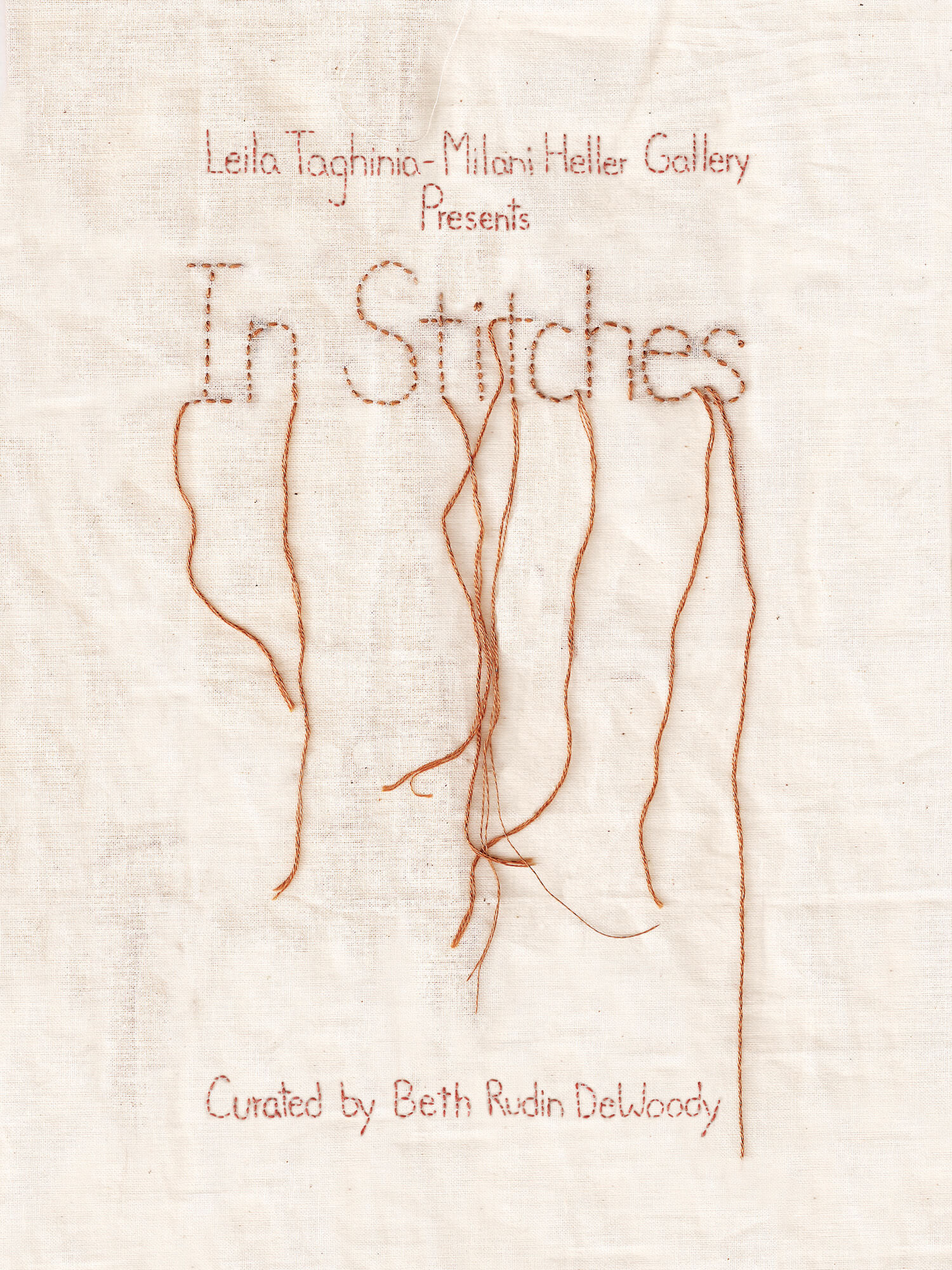
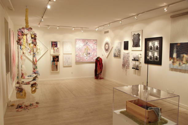
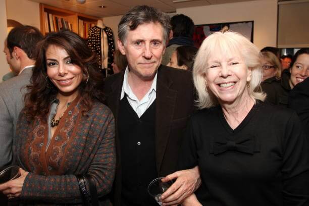
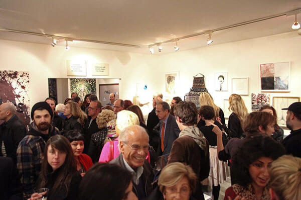
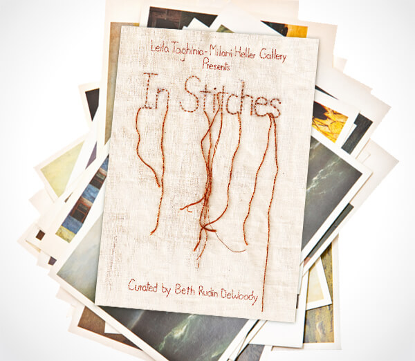
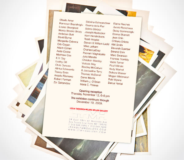
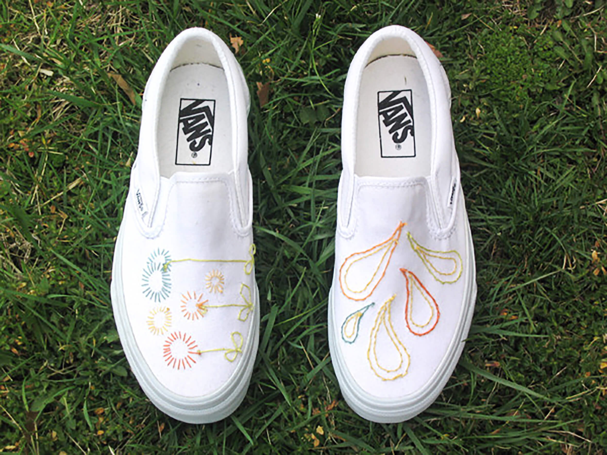
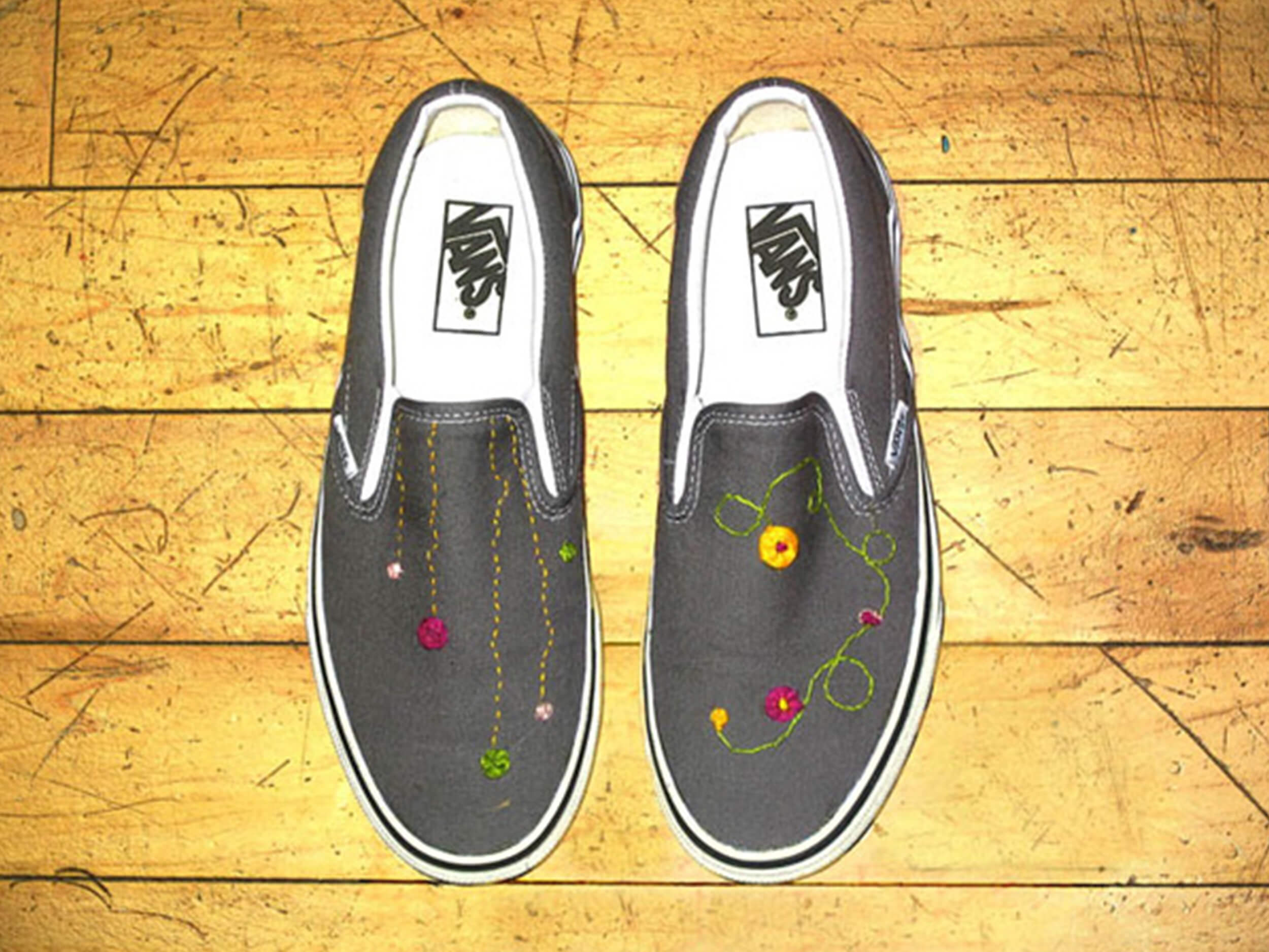
My friend Laura and I created the invite and poster for an embroidery art show in NYC. We both have a passion for fiber arts so this project was fun. Artists in the show included: Kiki Smith, Andy Warhol and David Byrne.
The American Express business travel team offers travel agent services to business customers around the world. Here is a holiday card I art directed when I was at Ogilvy that they sent out to their customers.
Red Bull had a contest where they invited fans to submit their ideas for a “Red Bull Gives You Wings” commercial. So I decided to make an ad. Even though it was submitted in the final week of the contest it ended up being in the top ten most popular ads out of thousands.
Brainstorm team: Miriam Langsam, Laura Migdon, Amalia Hohberger, David Dvorkin, Zach Moss Art Director; Illustrator; Flash Animator: Miriam Langsam Sound design: Josh Morrissey, the editor of The Strut.
I fell in love with fiber arts myself senior year of college when I took a class which tapped into my admiration for my grandmother who is a fiber artist.