Nantucket cranberry bog harvests are a staple of the Massachusetts autumns. Nantucket Cranberries are grown on the island of Nantucket by the Non-profit Nantucket Conservation Foundation. These Early Black and Howes varieties of cranberries are known for their rich color and high sugar/acid ratio and they are not harvested until they are at their peak of ripeness. Nantucket Cranberries are one of the largest producer of cranberries from the Northeast. The group was looking to update their logo and I thought it should feel fresh. I went for a variety of looks to give them options on the direction they'd want to take their brand.
This logo option is a classic crafty food-style logo. It has the feel of a logo that would represent a booth in a farmers market.
The outer dotted circle represents cranberries. The rest of the logo uses basic shapes are fonts to represent Nantucket cranberries.
Using funky shapes and colors we highlight the glory of the cranberry in this design.
Wet harvesting makes cranberries rise to the surface, so we created a cranberry bog in the shape of Nantucket.
This logo cleverly uses the cranberries in the shape of a “B” and the leaves in the shape of a “U.”
And the winner was!
Inspired by images of the bog in Nantucket, the red in the near side of the foreshortening represents the cranberries when they float to the surface during wet harvest season.
Power of Fruit
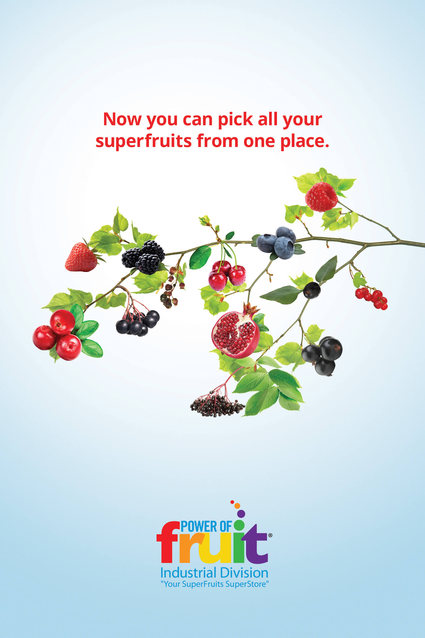
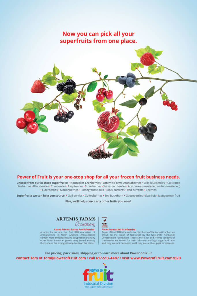
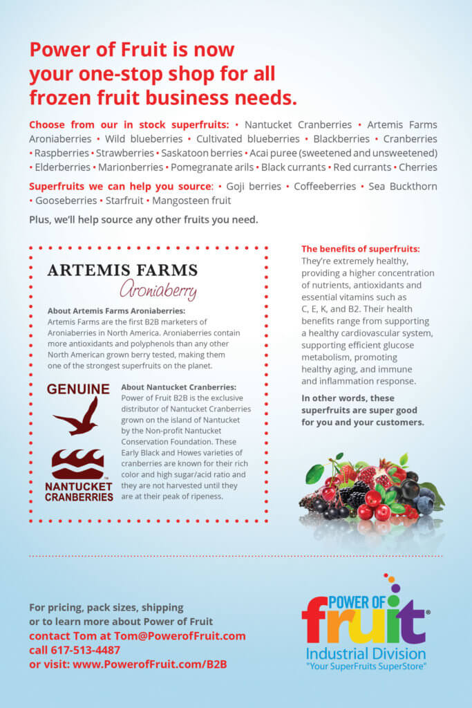
Power of Fruit B2B is the exclusive distributor of Nantucket Cranberries and is a one-stop shop for all frozen fruit business needs. As they were a partner company of Nantucket Cranberries, we helped designed assets for one of their trade show.